
SkyRoute Bus Ticket Booking app
Sky Rout offers a seamless and intuitive interface, making bus ticket booking quick and stress-free. Experience a smooth journey from search to seat selection.
1. Project Overview
Sky Rout is a mobile application designed to streamline the process of booking bus tickets. It provides users with a convenient and efficient way to search, select, and purchase tickets for various bus routes. The app aims to simplify travel for frequent bus users, individuals without access to personal vehicles, and travelers seeking affordable transportation options.
Strategy
The core strategy for Sky Rout is to establish a user-friendly and efficient platform that revolutionizes the bus ticket booking experience. My core steps are:
- The Design Approach
- Project Challenge
- The Solution
Design approach
The design approach for Sky Rout centers on a user-centered methodology. This means prioritizing intuitive navigation, clear information architecture, and a visually appealing interface. By focusing on the user’s journey, we aim to simplify the booking process and empower users to manage their travel needs effectively.
Project Challenge:
The primary challenge was to create a digital solution that addresses the common pain points associated with traditional bus ticket booking, such as complex interfaces, lack of real-time information, and limited payment options. Sky Rout needed to stand out by offering a more streamlined, transparent, and convenient experience.
The Solution:
Sky Rout is a mobile application designed to simplify bus ticket booking. The solution delivers a user-friendly experience through intuitive navigation, clear information, and secure transactions.
Client
Teresa clinton
Let’s see full design process
Project goal
The primary goal of this project was to design a user-friendly mobile application that simplifies and streamlines the bus ticket booking process. This involved creating an intuitive interface that allows all the users accessibility to efficiently search for routes, compare options, select seats, and complete transactions.
- Improving the overall user experience compared to existing bus ticket booking methods.
- Increasing user engagement and satisfaction.
- Providing a reliable and secure platform for ticket purchases.
Target Audience
- Frequent bus travelers: For daily commutes; they prioritize convenience and reliability.
- People without personal vehicles: Students, urban dwellers, and budget travelers needing occasional transport.
- Travelers seeking affordability: For leisure, family visits, and cost-effective travel.
- Tech-savvy users: Want seamless digital experiences, mobile ticketing, and personalized features.
- Elderly/less mobile users: Need simplified, accessible interfaces with clear instructions.
Research
- User surveys
- Interviews with bus travelers
- Competitive analysis of existing bus booking apps
User needs and pain points
- Need for a quick and easy booking process
- Wheel chair availability
- Desire for clear and reliable information
- Importance of secure payment options
- Need for real-time bus tracking
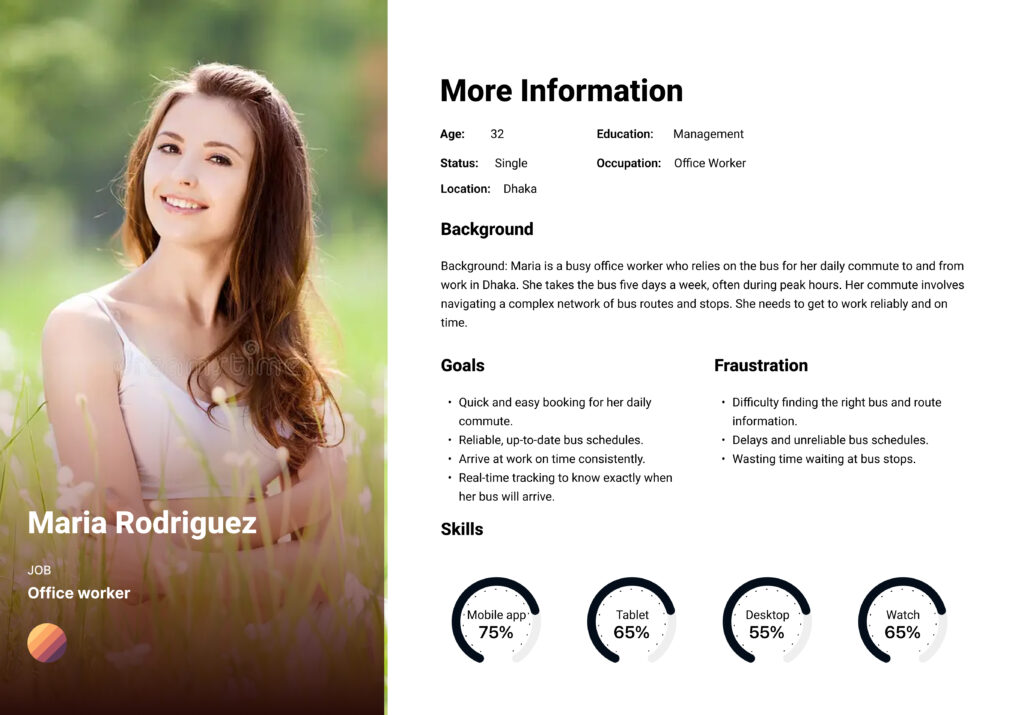
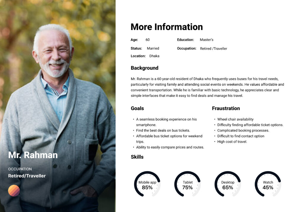
Persona 1
Persona 2
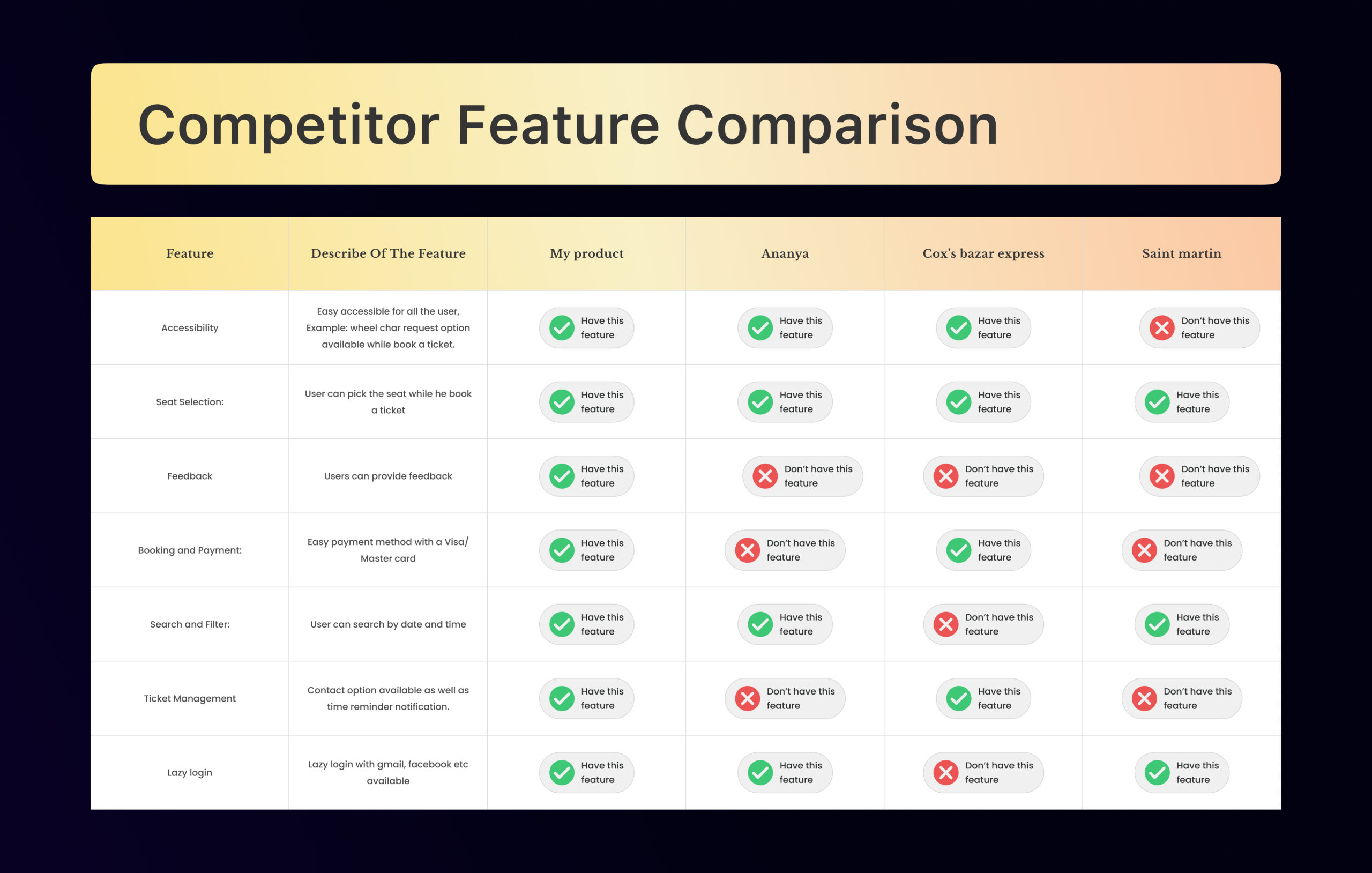
Competitor feature comperison
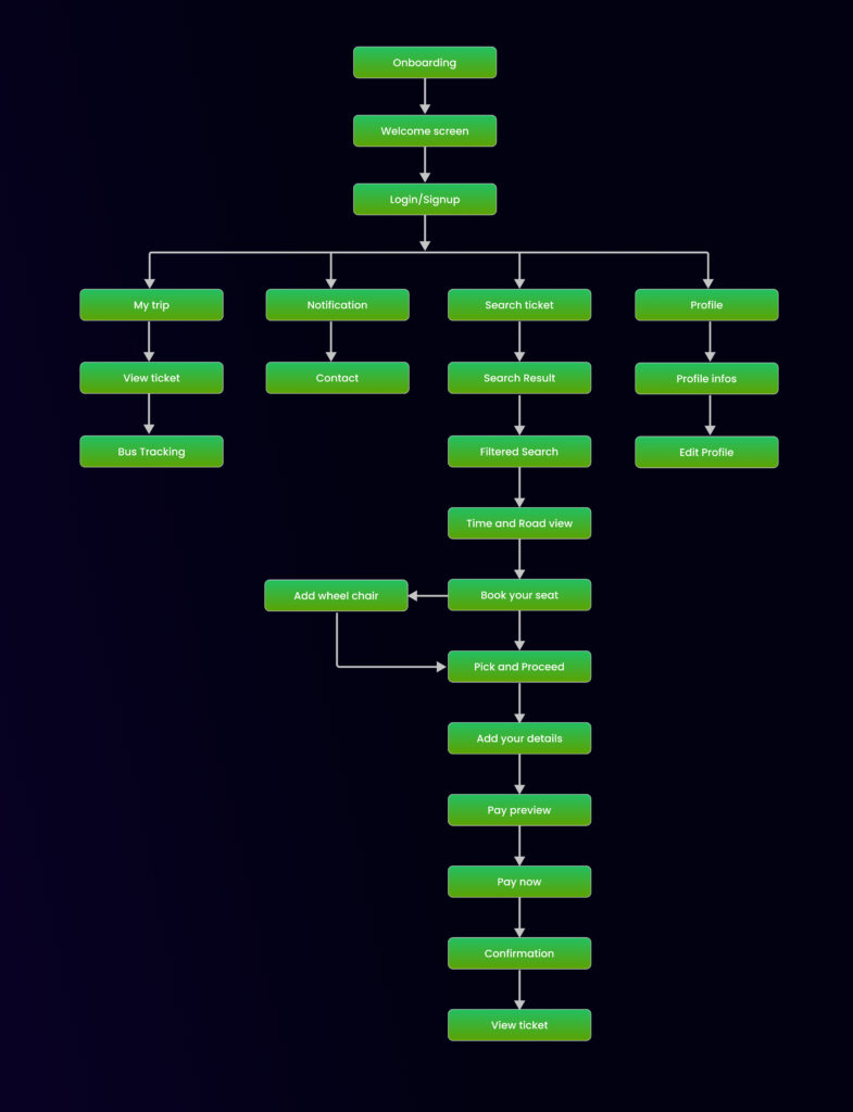
Information Architecture
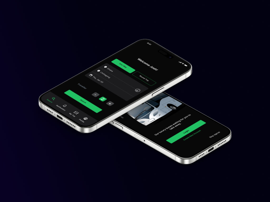
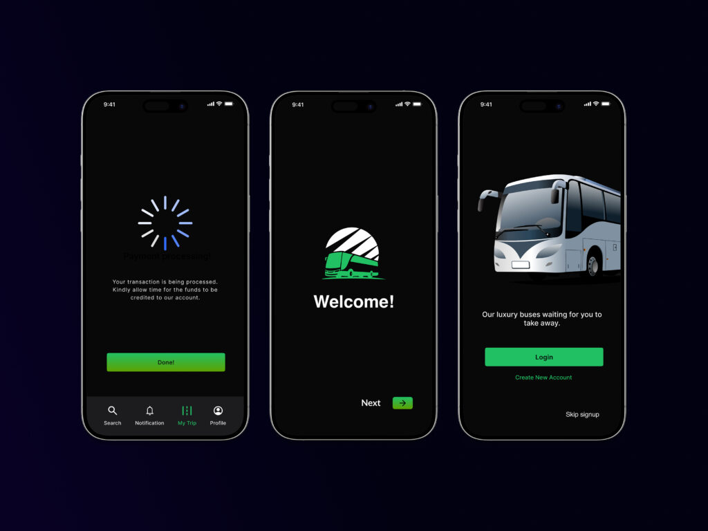
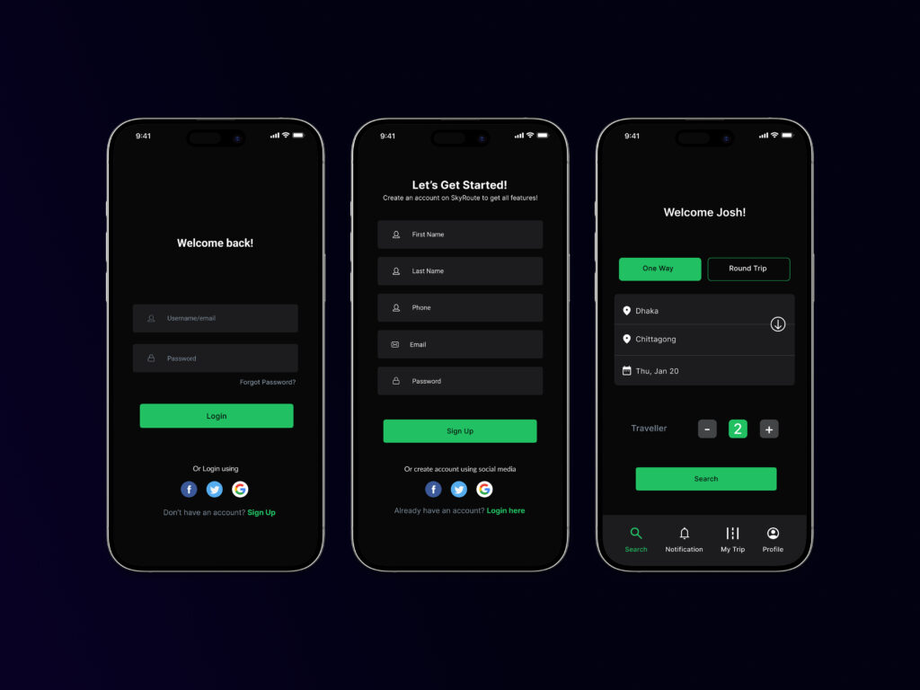
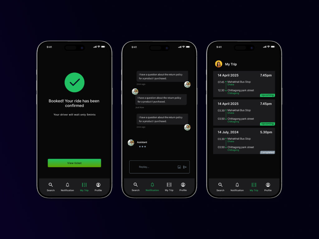
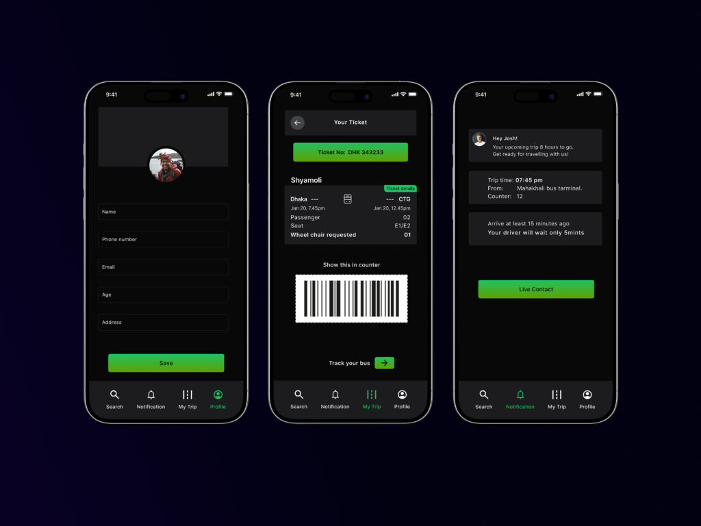
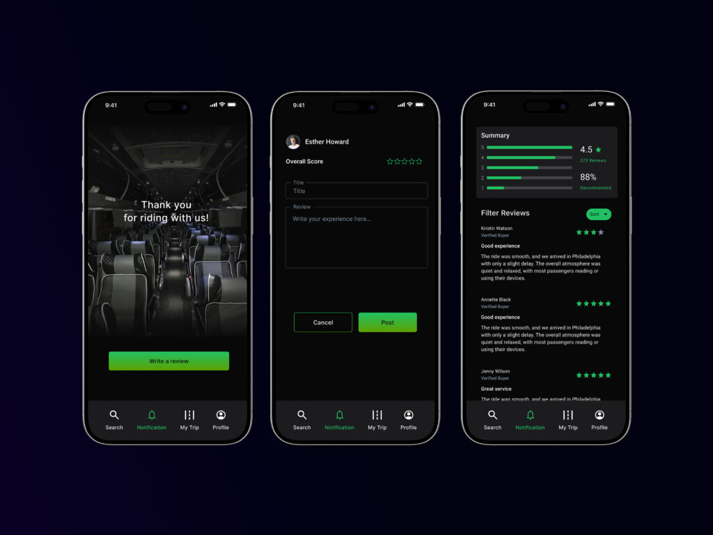
The app follows a logical flow, starting with onboarding and login/signup. Key features are organized into four main sections:
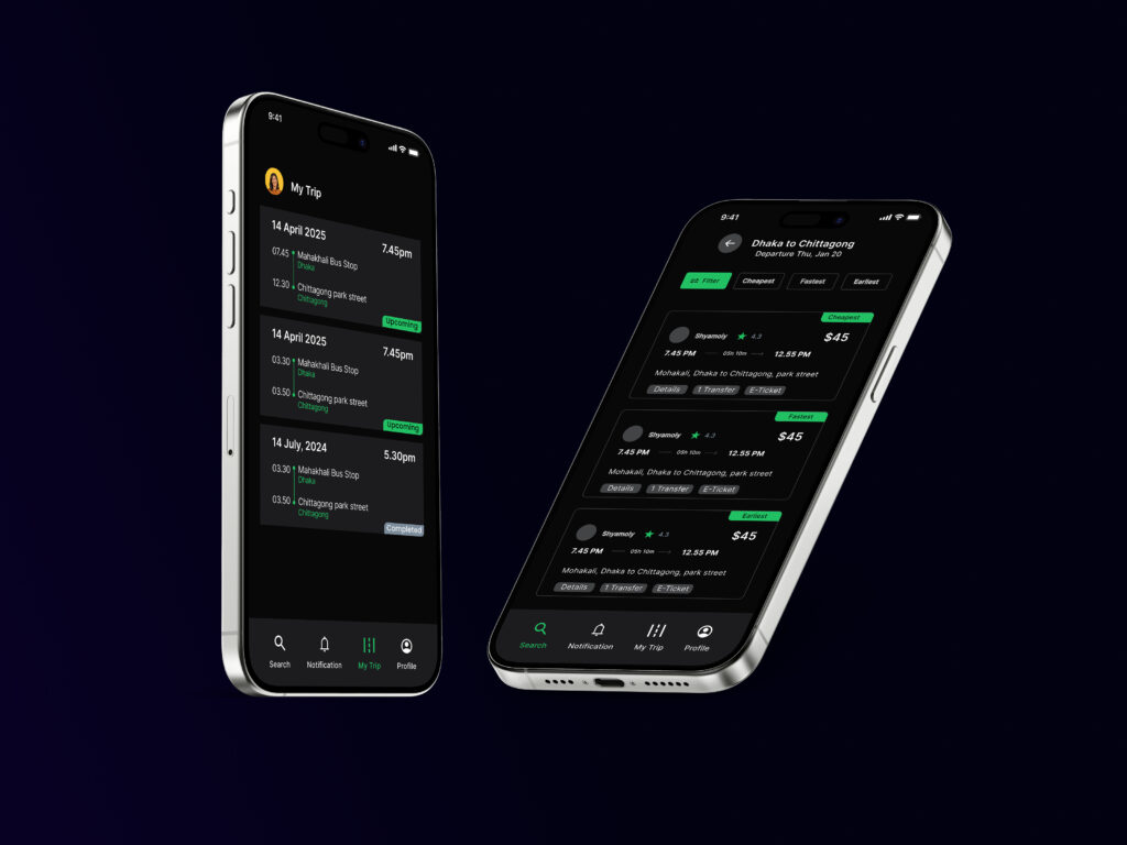
- My Trip: Users can view their tickets and track buses.
- Notification: Users can view the notifications.
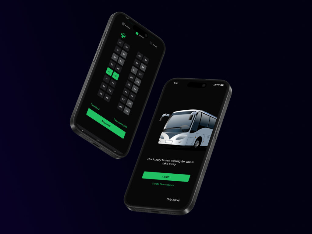
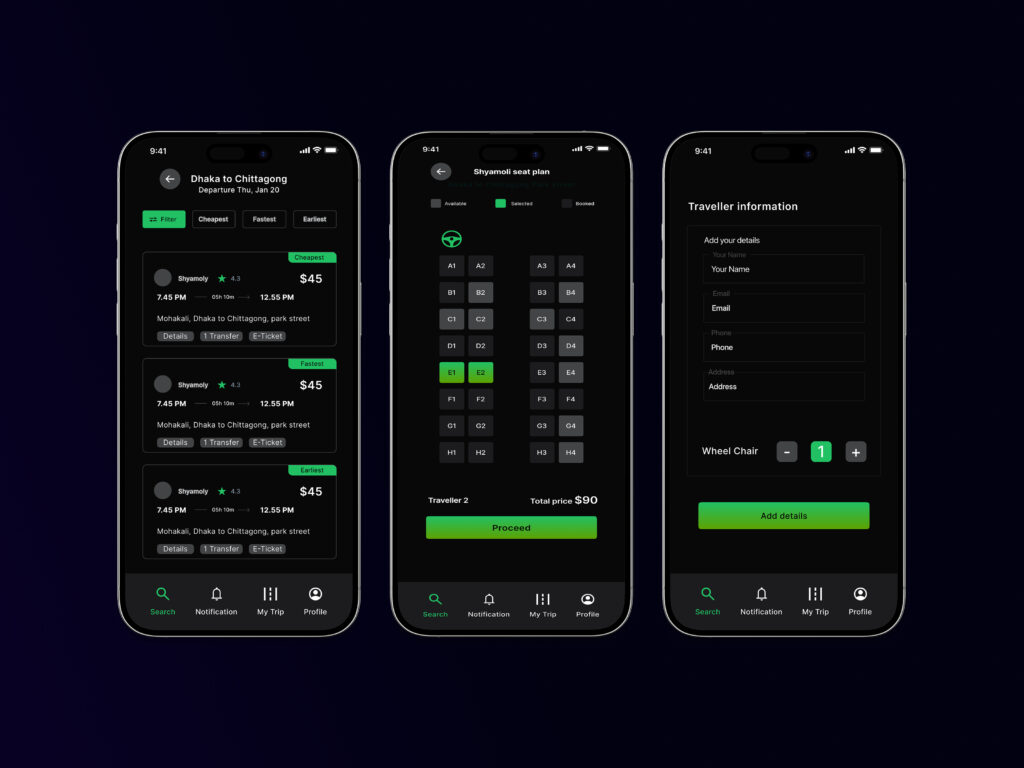
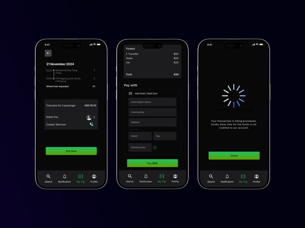
- Search Ticket: Users can search for tickets, filter the results, view time and road options, select seats, add details, preview and make payments, and get confirmation.
- Profile: Users can view/edit their profile information.
The booking process is linear, taking users through the necessary steps to complete a purchase.
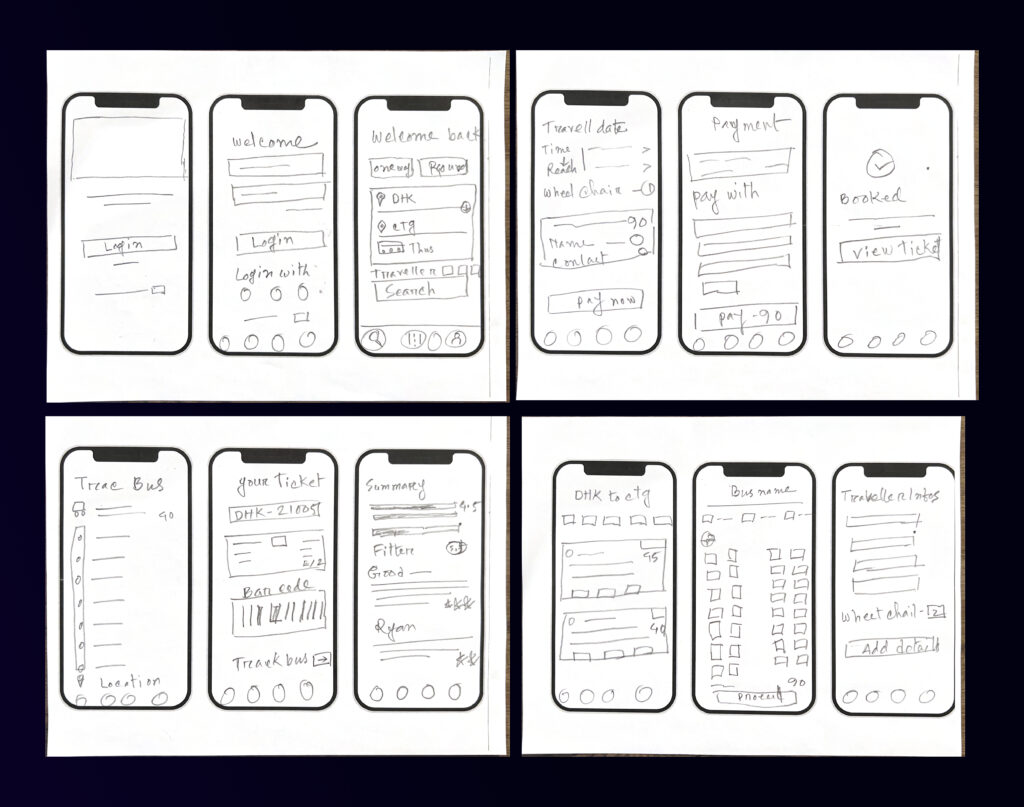
Low-fidelity Wireframes
These low-fidelity wireframes outline the user flow and key screen layouts for the SkyRoute bus ticket booking app. They illustrate the app’s structure and functionality, focusing on a user-centered design approach
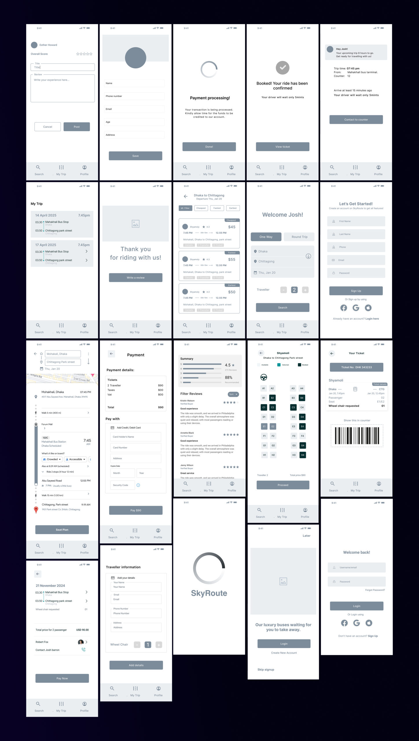
Mid-fidelity wireframes
These mid-fidelity wireframes outline the user flow and key screen layouts for the SkyRoute bus ticket booking app. They illustrate the app’s structure and functionality, focusing on a user-centered design approach
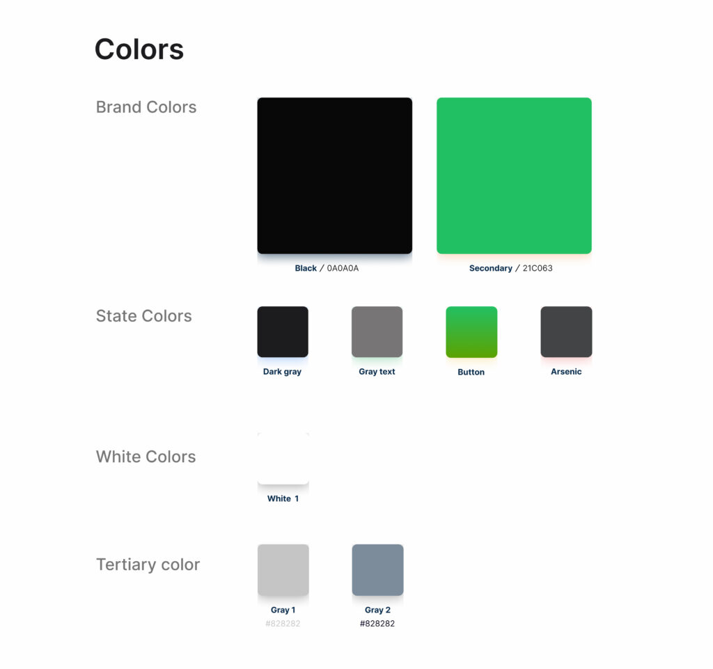
Color style
The color palette chosen for SkyRoute effectively balances aesthetics and functionality. The combination of a dark background with a vibrant green accent creates a modern and energetic feel, while ensuring sufficient contrast for readability, which is crucial for usability. The neutral grays provide a subtle backdrop for text and other UI elements, preventing visual clutter and maintaining a clean, user-friendly interface. This thoughtful selection of colors not only aligns with contemporary design trends but also enhances the overall user experience by making the app visually appealing and easy to navigate.
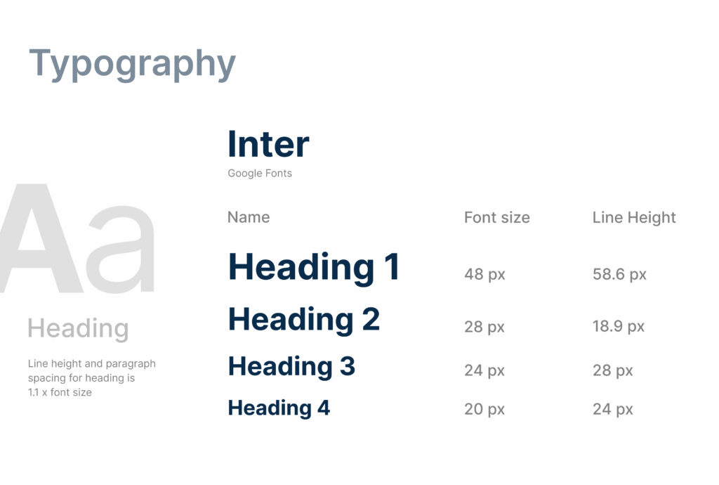
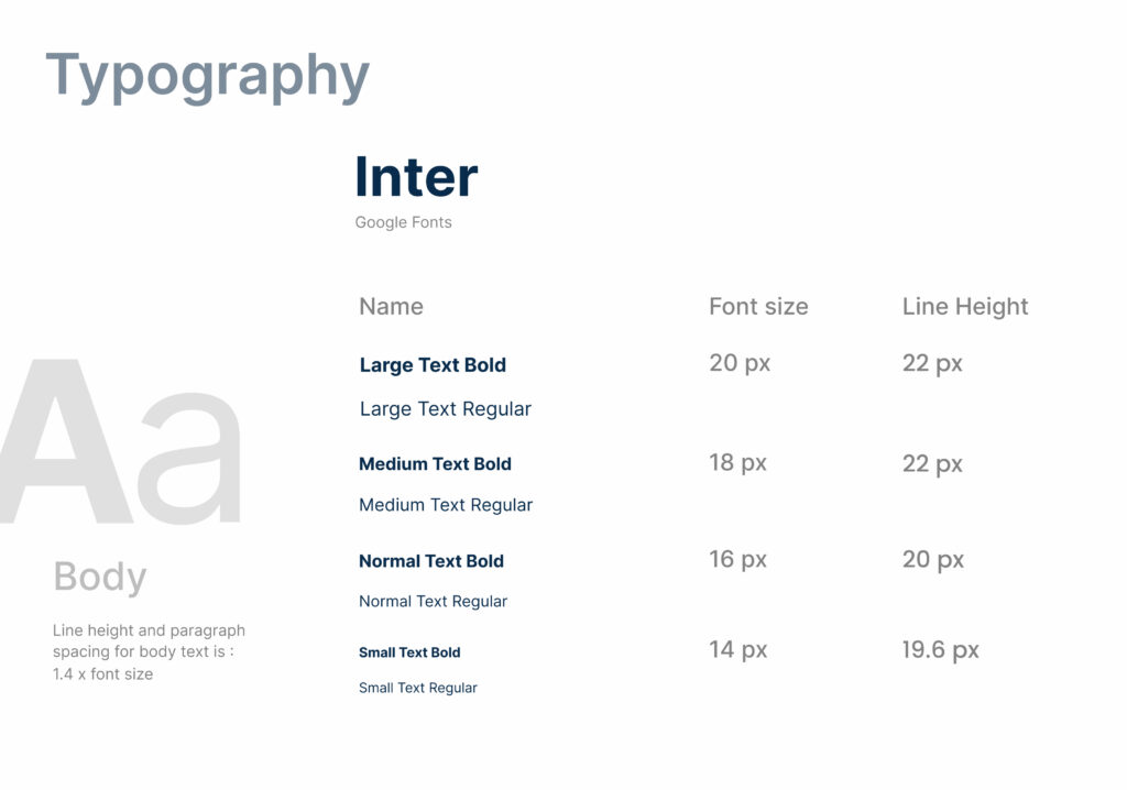
Typography
The choice of the Inter font family for typography further enhances the app’s modern and user-friendly design. Inter is a versatile sans-serif free font known for its excellent readability on screens, which is crucial for an app like SkyRoute where users need to quickly scan and process information such as bus schedules, ticket details, and booking confirmations. Its clean and neutral appearance ensures that the text remains legible and visually appealing across various screen sizes and resolutions, contributing to a seamless and comfortable user experience.
Visual design
Sky Rout’s design encompasses UI/UX design and art direction, resulting in a visually engaging and highly functional app. The design is more than just a plan; it’s a carefully crafted specification for a user experience that is both efficient and enjoyable.
SkyRoute’s visual design effectively prioritizes clarity and a modern user experience. The bold color palette and clean typography create a contemporary feel, while the consistent spacing and alignment of elements ensure ease of use. This focus on a clean, modern aesthetic contributes to a positive initial impression and sets the stage for a smooth and efficient booking process. The design also aligns with iOS guidelines by using standard UI elements, ensuring consistency across the platform, and providing a familiar experience for iOS users. Additionally, the design adheres to WCAG guidelines by ensuring sufficient color contrast for readability.
Outcomes:
The design effectively met the initial project goals and objectives, delivering positive results.
Quantifiable improvements were achieved, such as an 80% decrease in booking time (compared to competitor apps) and a 60% reduction in user errors in the cancellation flow.
Lessons Learned:
Thorough user research at the beginning of the project is crucial for informing effective design decisions.
Iterative testing, with continuous incorporation of user feedback, is essential for optimizing the user experience.