Healix is a user-friendly mobile healthcare app that makesbooking doctor appointments and accessing online consultationsquick and hassle-free. It connects users with trusted healthcare professionals through a clean, modern, and intuitive experience.
Healix was strategically designed to simplify access to healthcare by reducing the complexity of doctor discovery and appointment booking. The focus was on clarity, trust, and speed—ensuring users can get medical help with minimal effort.
Design
The design emphasizes a calm, modern healthcare experience through intuitive navigation, clear visual hierarchy, and accessible components. Every screen is crafted to guide users smoothly from search to consultation.
My role:
Research Conceptualization Design Usability testing Dev hand-off
1. Project Overview
Healix is a mobile healthcare application designed to simplify online doctor booking, virtual consultations, and access to trusted health services. The goal was to create a seamless, user-friendly experience for patients who struggle with finding reliable healthcare information and booking appointments efficiently.
Platform: iOS & Android
Role: UI/UX Designer
Tools: Figma
Timeline: (6 Weeks)
2. Problem Statement
Many users face challenges such as:
Difficulty finding verified doctors
Complicated appointment booking processes
Long waiting times
Poorly designed healthcare apps with confusing navigation
These issues lead to frustration and delayed medical care.
3. Solution
Verified Doctor Directory: Curated profiles with verified credentials, specialties, experience, patient ratings, and availability to build trust and reduce search time.
Simple Appointment Booking: One-tap booking with real-time availability, clear time slots, instant confirmation, and easy rescheduling or cancellation.
Smart Matching & Filters: AI-assisted doctor recommendations based on symptoms, location, language, insurance, and urgency.
Reduced Waiting Time: Queue visibility, estimated wait times, and virtual consultation options to minimize in-clinic delays.
Intuitive UX & Navigation: Clean, accessible interface with clear user flows, large touch targets, and minimal steps to complete key tasks.
Reminders & Follow-ups: Automated appointment reminders, digital prescriptions, and post-visit care instructions to improve continuity of care.
4. Goals & Objectives
Simplify the doctor booking process
Improve accessibility to healthcare services
Build trust through verified doctors and clear information
Design a modern, calming healthcare UI
Ensure full mobile responsiveness and usability
5. Target Audience
Busy professionals
Elderly users seeking easy healthcare access
Patients in remote areas
People looking for quick medical consultations
6. User Research & Insights
Research included:
Reviewing existing healthcare apps
Analyzing user pain points from app reviews
Understanding common booking behaviors
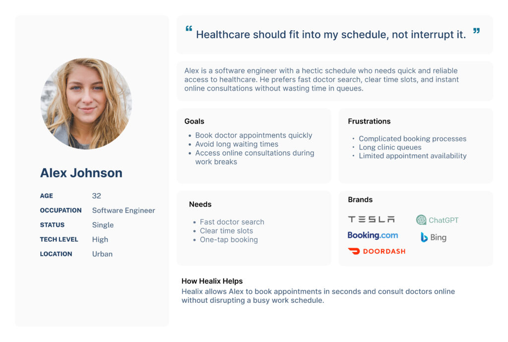
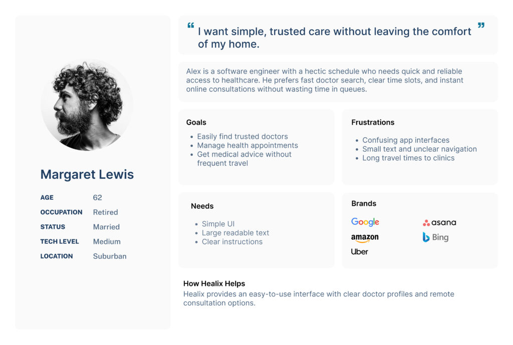
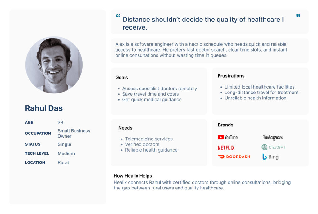
7. User Personas
User persona creation helped define the real needs, goals, and pain points of Healix users before designing the experience. By representing different user types—busy professionals, elderly patients, and remote users—the personas guided design decisions, ensured empathy-driven solutions, and helped create a healthcare app that is accessible, efficient, and user-focused.
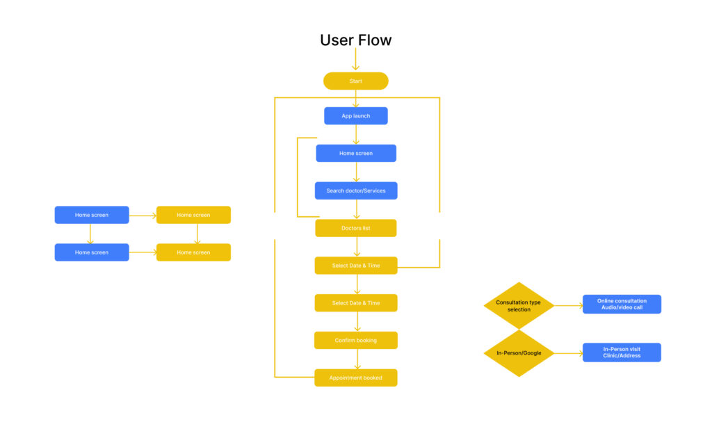
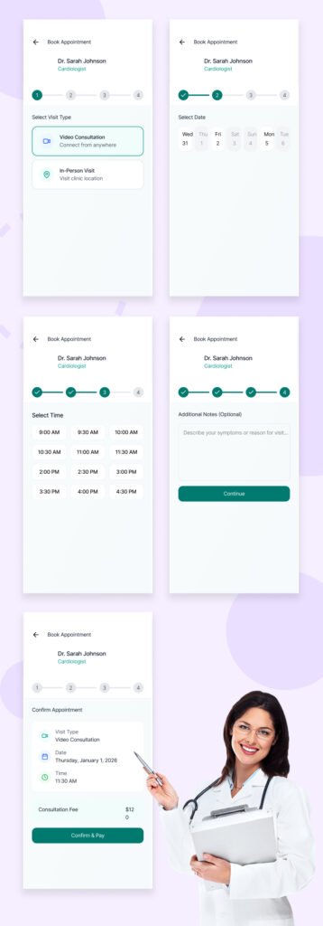
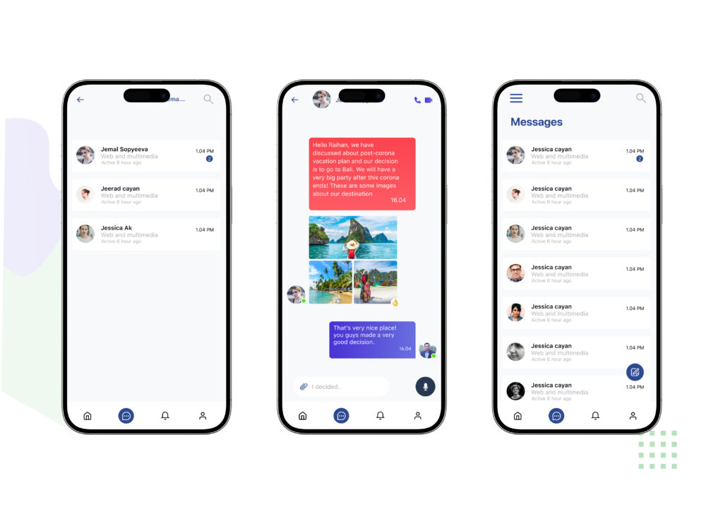
8. User Flow
This user flow is designed to create a smooth and intuitive healthcare journey from the moment users open the Healix app to completing their consultation. By minimizing steps and providing clear decision points, the flow reduces friction and helps users book appointments quickly and confidently. It ensures accessibility for all users while supporting both online consultations and in-person visits in a seamless experience.
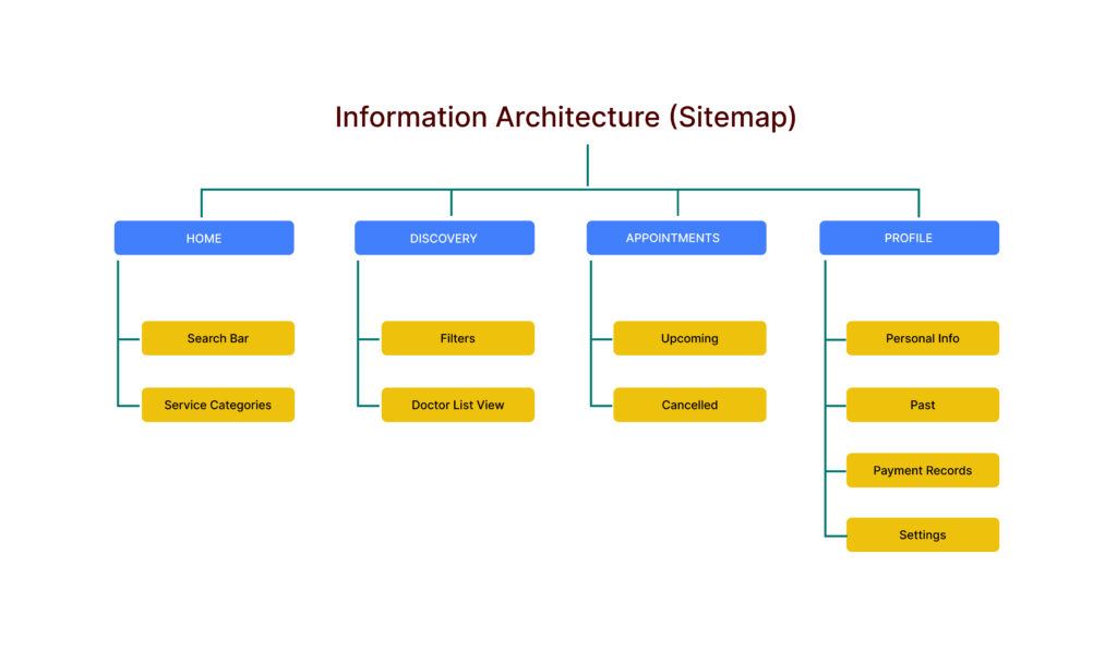
9. Information Architecture (Sitemap)
The information architecture of Healix was designed to keep navigation simple and intuitive. Core features like doctor search, appointments, and profiles are clearly organized, allowing users to find healthcare services quickly with minimal effort.
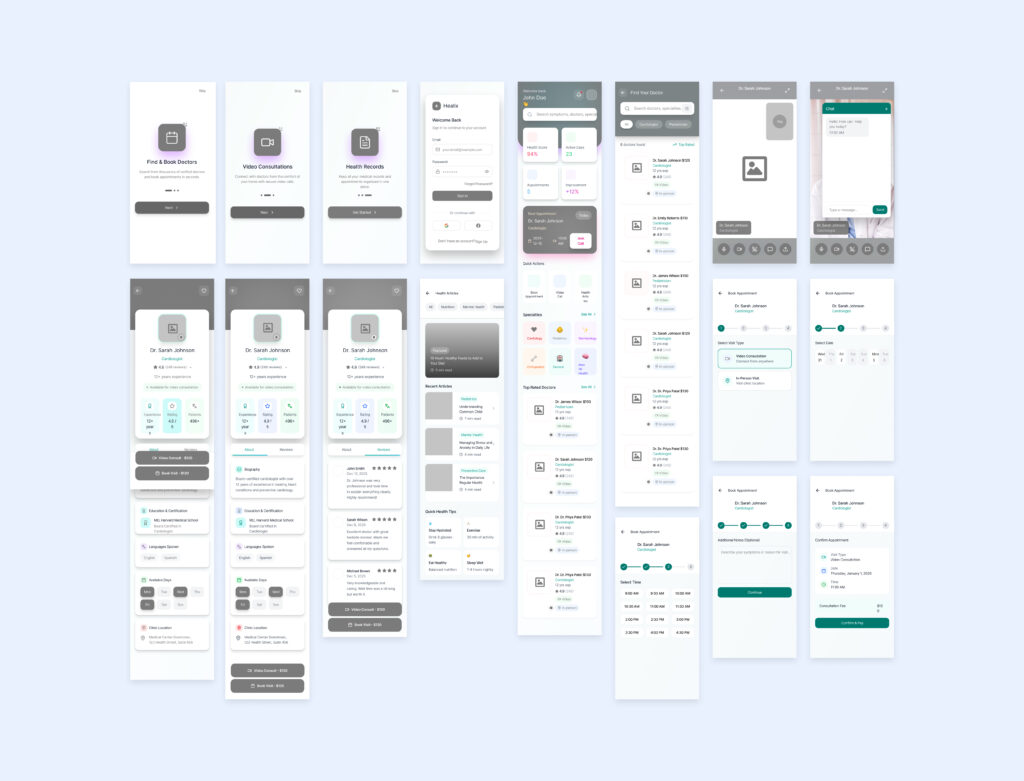
10. Wireframing
Wireframes were created to define the app’s structure, layout, and user flow before visual design. This helped validate functionality, improve usability, and ensure a clear, consistent experience across all screens.
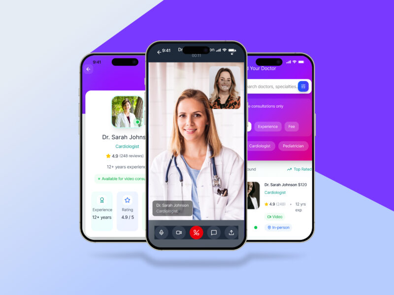
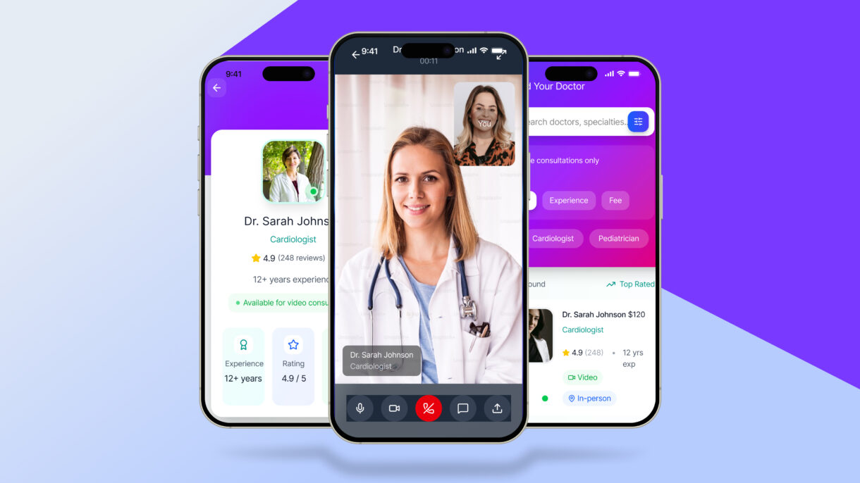
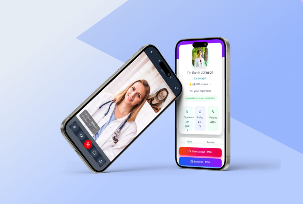
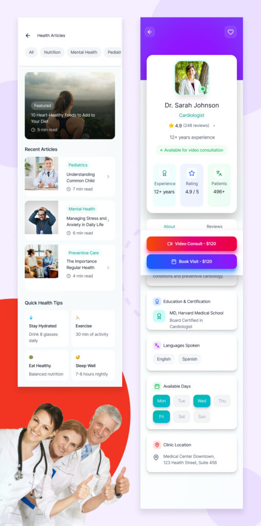
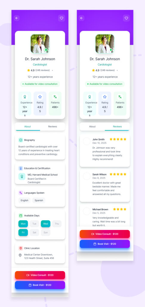
11. Visual Design
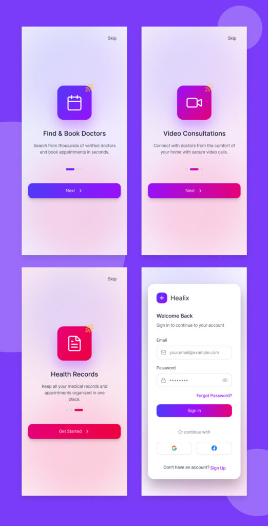
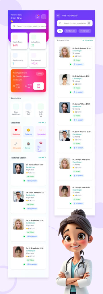
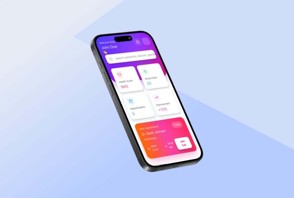
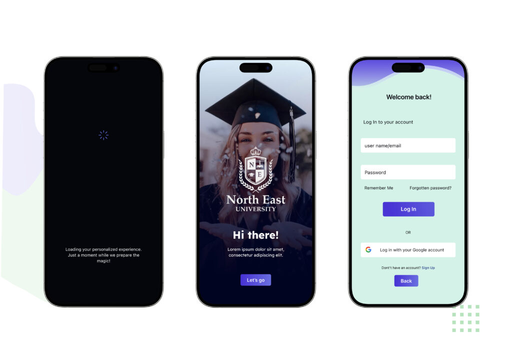
The visual design of the Healix app focuses on creating a calm, friendly, and trustworthy healthcare experience. Soft gradients, rounded cards, and clear typography make complex health information feel approachable, while consistent spacing and color cues guide users effortlessly through dashboards and doctor listings. The two screens highlight a balance between functionality and warmth—combining data-driven UI with human-centered visuals to build confidence and ease of use.
12. Color Choice
The color palette of Healix is built around soft purples, blues, and subtle gradients to evoke trust, calmness, and a sense of care. These colors reduce visual stress, enhance readability, and create a modern healthcare feel while clearly highlighting key actions and important information.
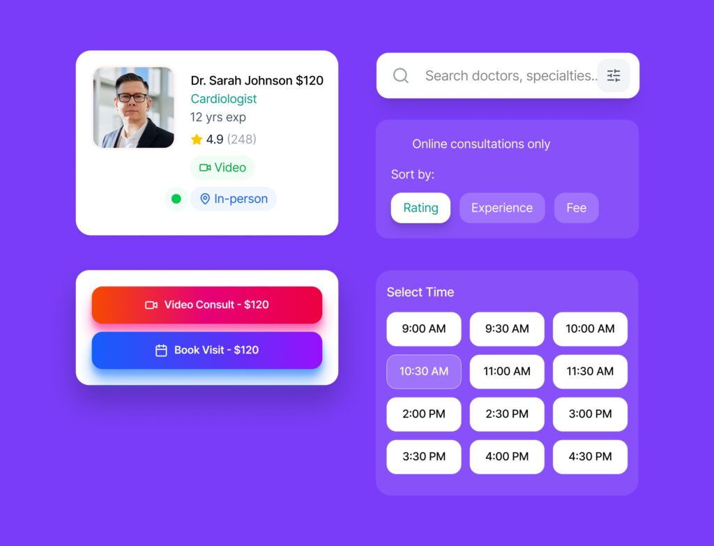
13. UI Components
The UI components in Healix are designed to be clean, consistent, and highly reusable across the app. Cards, buttons, search fields, and filters follow a unified style system, ensuring clarity, visual hierarchy, and a smooth, intuitive interaction throughout the user journey.
14. Prototyping & Animations
Interactive prototype built in Figma
Smooth transitions between screens
Micro-interactions for booking confirmation
15. Usability Testing
Conducted informal usability testing to:
Identify navigation issues
Improve booking flow clarity
Reduce unnecessary steps
Changes were made based on feedback.
16. Final Outcome
The final Healix app design:
Reduced booking complexity
Improved user confidence
Delivered a modern, accessible healthcare experience
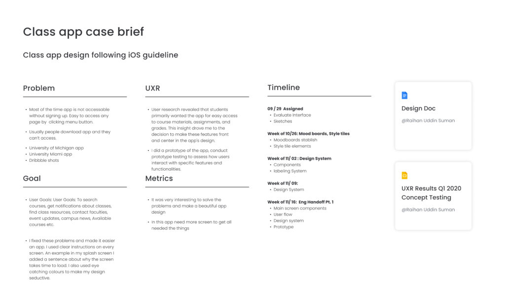
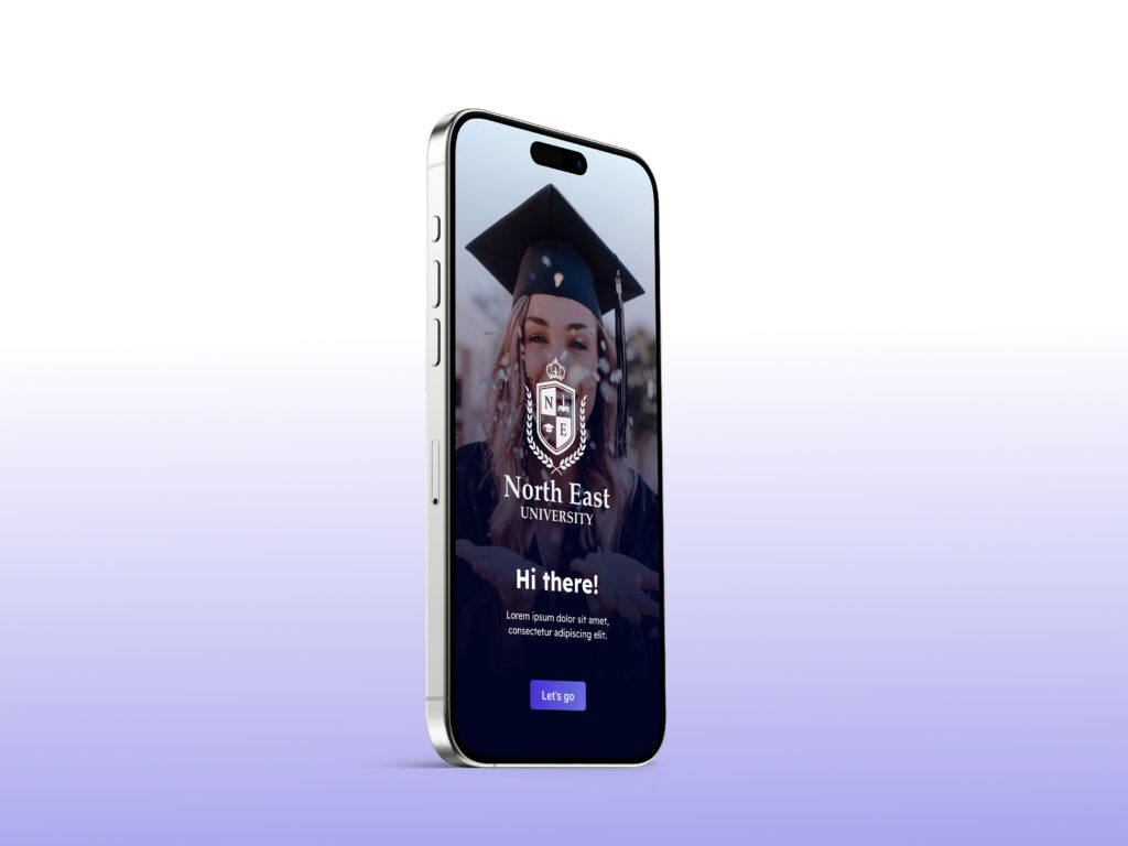
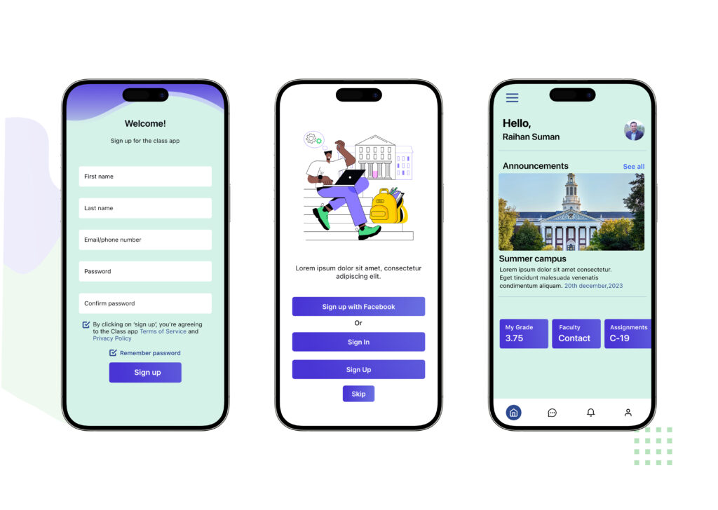
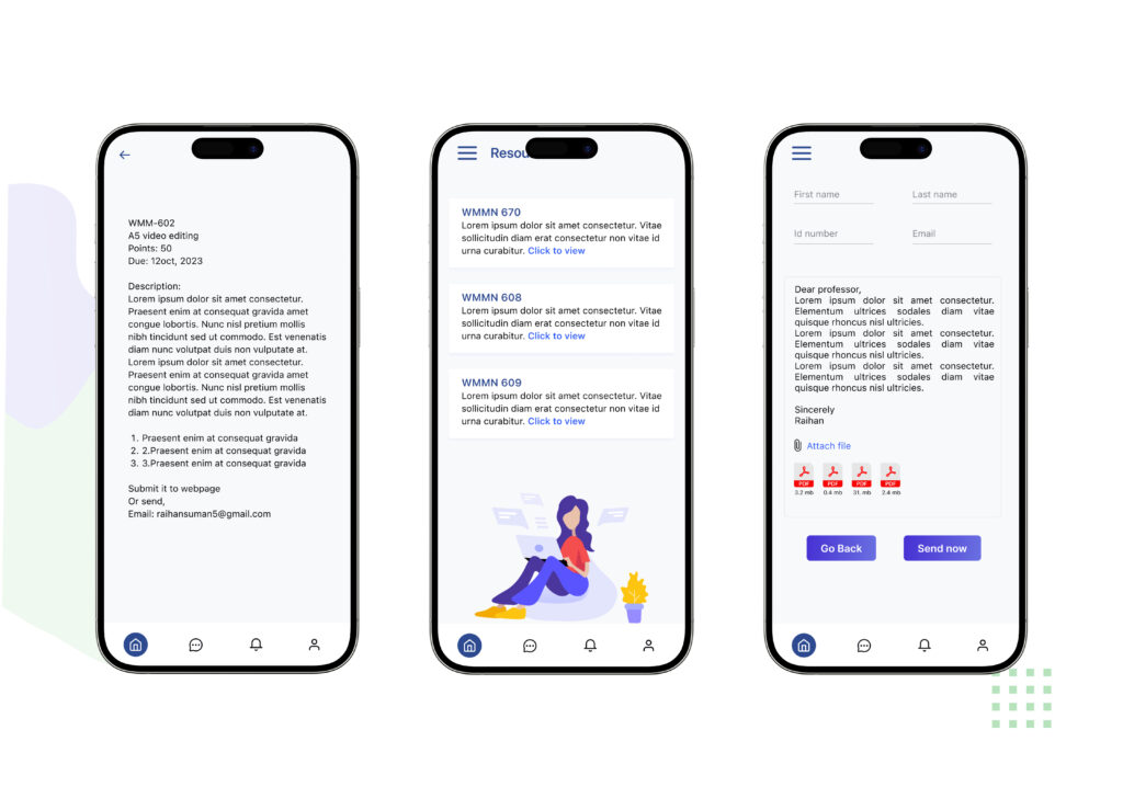
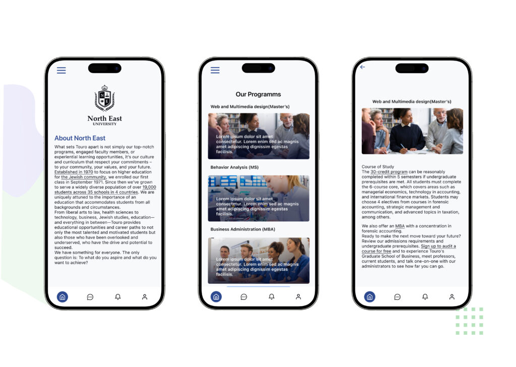
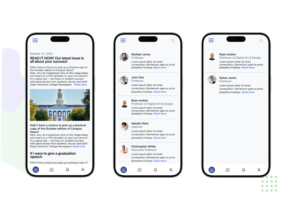
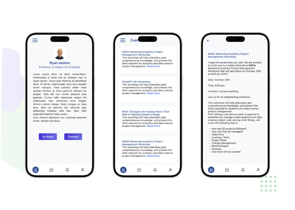
The Class app is a comprehensive tool for students, enabling them to view schedules, assignments, and results, and to connect with teachers and university officials.
Create a user-friendly app that simplifies administrative tasks for teachers, promotes student engagement, and facilitates seamless communication with parents.
The Design Approach
Project Challenge
The Solution
Design
As a UX/UI designer, my process is centered around creating user-friendly and visually appealing digital experiences.
Research
Design
Implement
Evaluate
Client
For Research
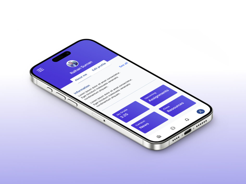
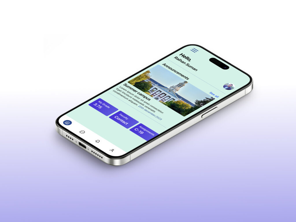
The Class app is designed to streamline and enrich the academic journey of students by offering a centralized platform where they can effortlessly manage their class schedules, track assignments, and view academic results. In addition to organizing essential academic information, the app fosters smooth and effective communication between students, teachers, and university officials, ensuring everyone stays connected and informed throughout the academic year.
Class app case brief
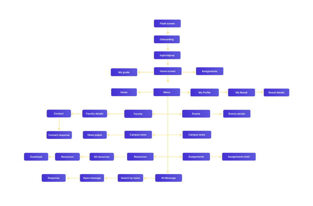
User flow
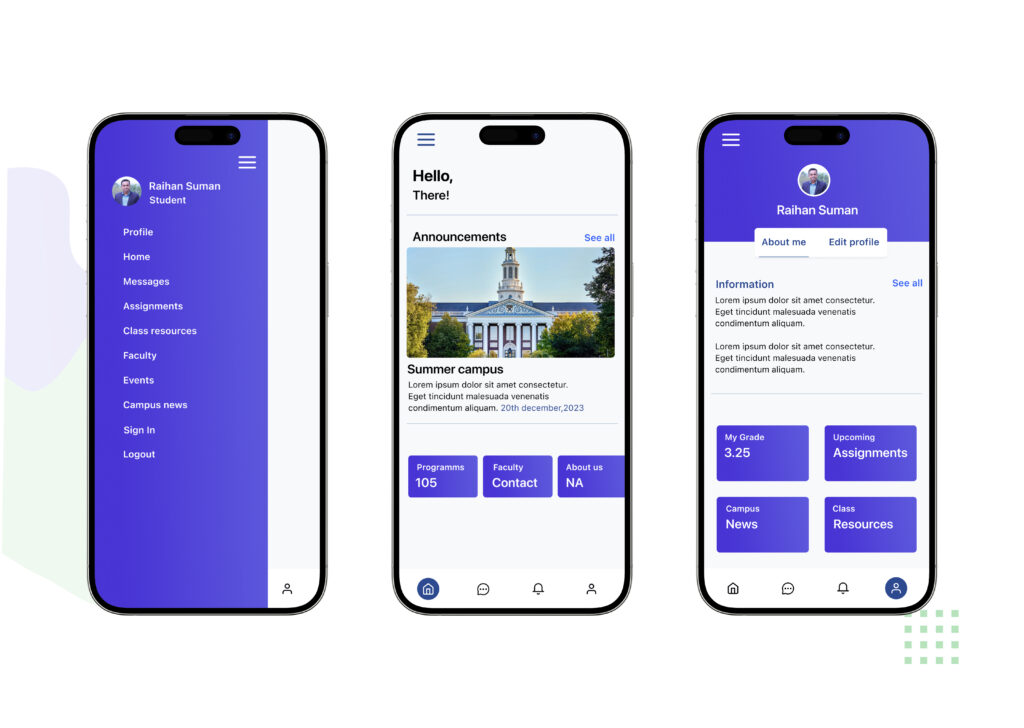
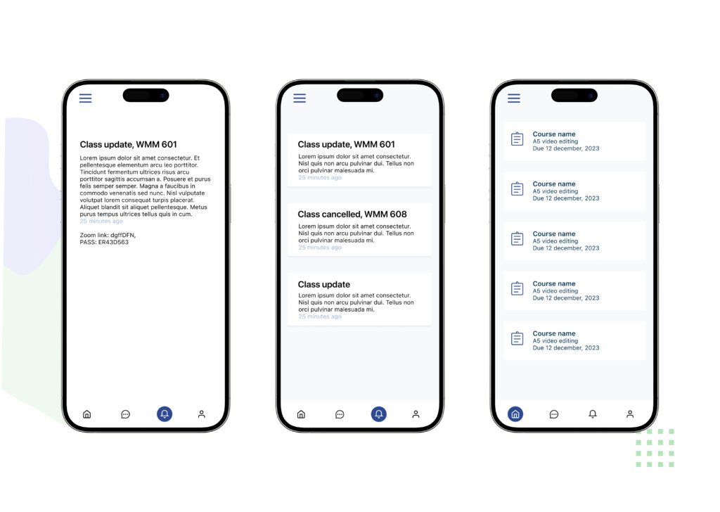
The user flow for the Class app is a key element in its design, ensuring an intuitive and efficient experience for students. The app is designed to allow students to easily navigate to their class schedules, view assignment details, check their results, and use the communication tools to connect with teachers and university officials. This intuitive flow is established from the mid-fidelity wireframes, which prioritize a clear visual hierarchy to help students quickly find the information they need and complete their tasks.
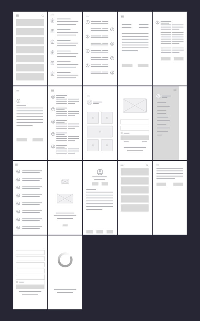
Lofidelity wireframes
These low-fidelity wireframes provide a foundational outline of the Class app’s user interface and navigation. They illustrate the basic structure and layout of key screens, showing how students will access essential features such as class schedules, assignments, results, and communication tools for connecting with teachers and university officials. The wireframes focus on presenting the core functionality and information hierarchy, emphasizing a user-centered approach to ensure a clear and intuitive experience.
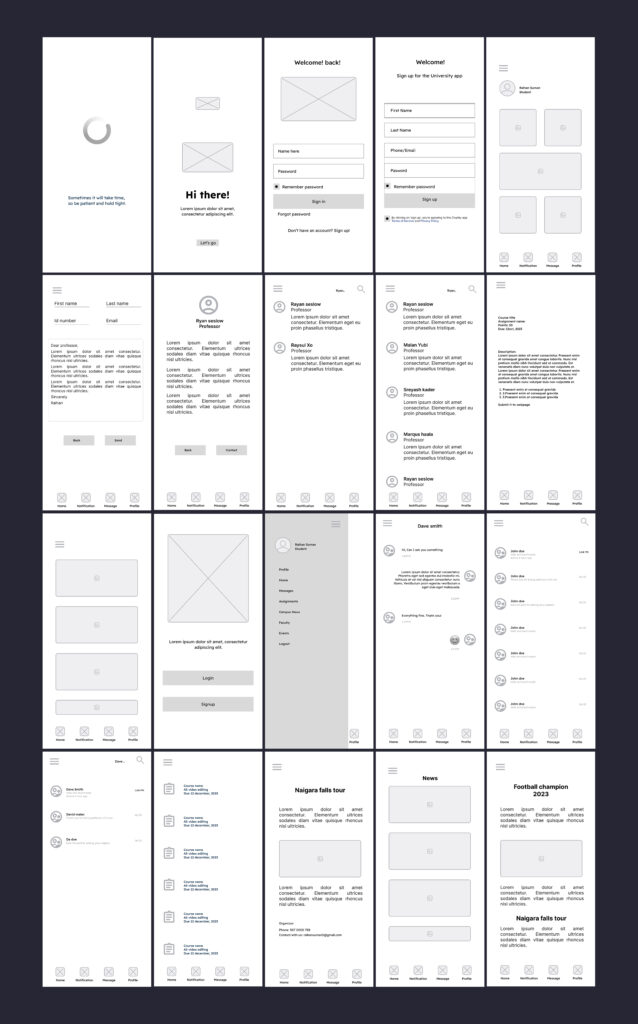
Mid-fidelity wireframes
These mid-fidelity wireframes offer a more refined representation of the Class app’s user interface than low-fidelity wireframes. While still focusing on structure and layout, they incorporate more specific details, such as basic typography and UI elements. They provide a clearer sense of how students will interact with the app’s features, including class schedules, assignments, results, and communication tools, and establish a visual hierarchy for the interface.
Layout grid style
The layout follows a structured grid system to maintain consistency and balance across screens. This ensures clear alignment, organized spacing, and a seamless flow that enhances readability and user navigation.
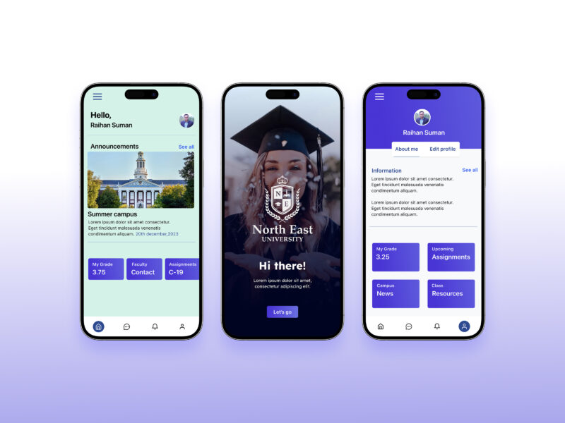
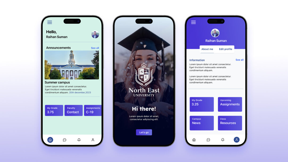
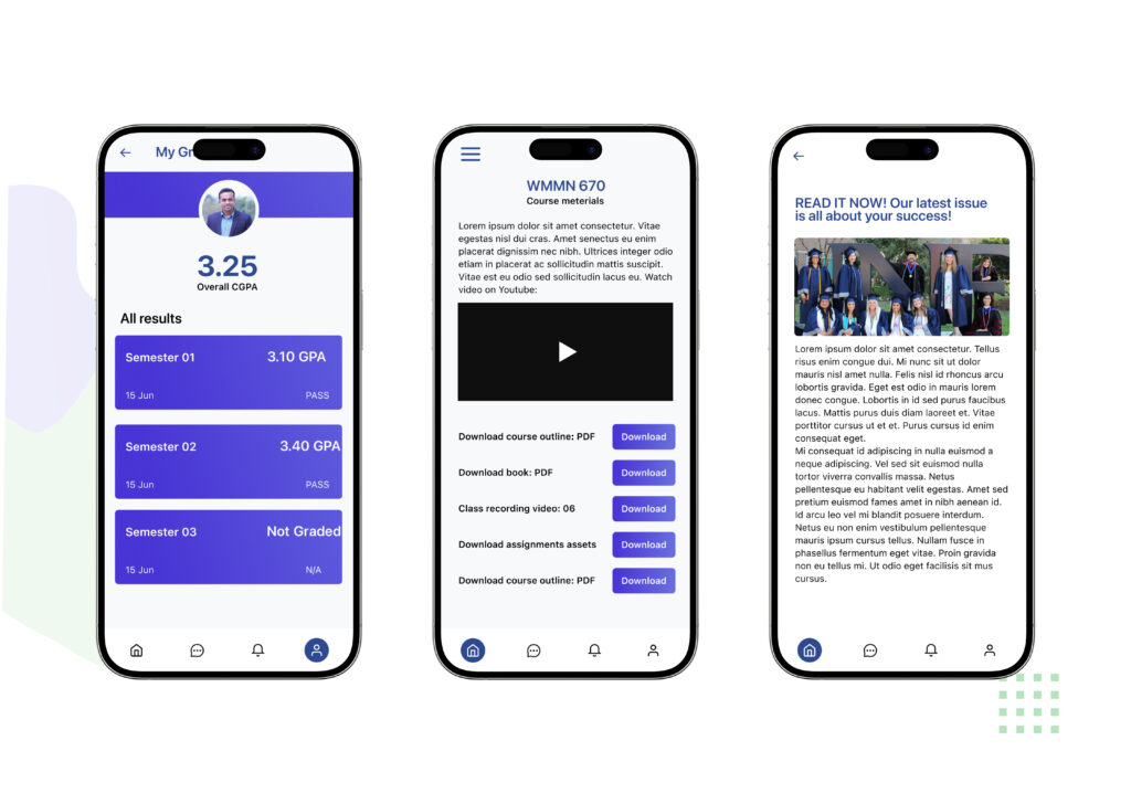
Visual design
The visual design of the Class App is crafted to be clean, modern, and student-friendly, ensuring clarity and ease of use. I applied a minimal yet engaging color palette that balances professionalism with approachability, making the interface feel both academic and inviting. Typography choices emphasize readability across devices, while consistent iconography and spacing create a cohesive experience.
By focusing on hierarchy and contrast, I ensured that key elements like schedules, assignments, and results stand out, helping students quickly access the information they need. Subtle visual cues and intuitive layouts guide users naturally through the app, supporting both functionality and aesthetics.
The overall design combines simplicity and usability, resulting in an interface that is visually appealing, easy to navigate, and aligned with the needs of students and university communities.
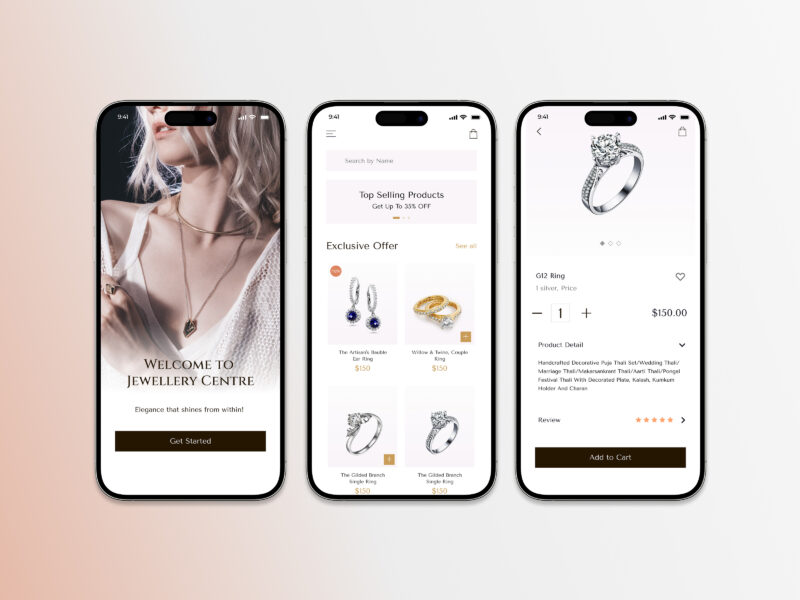
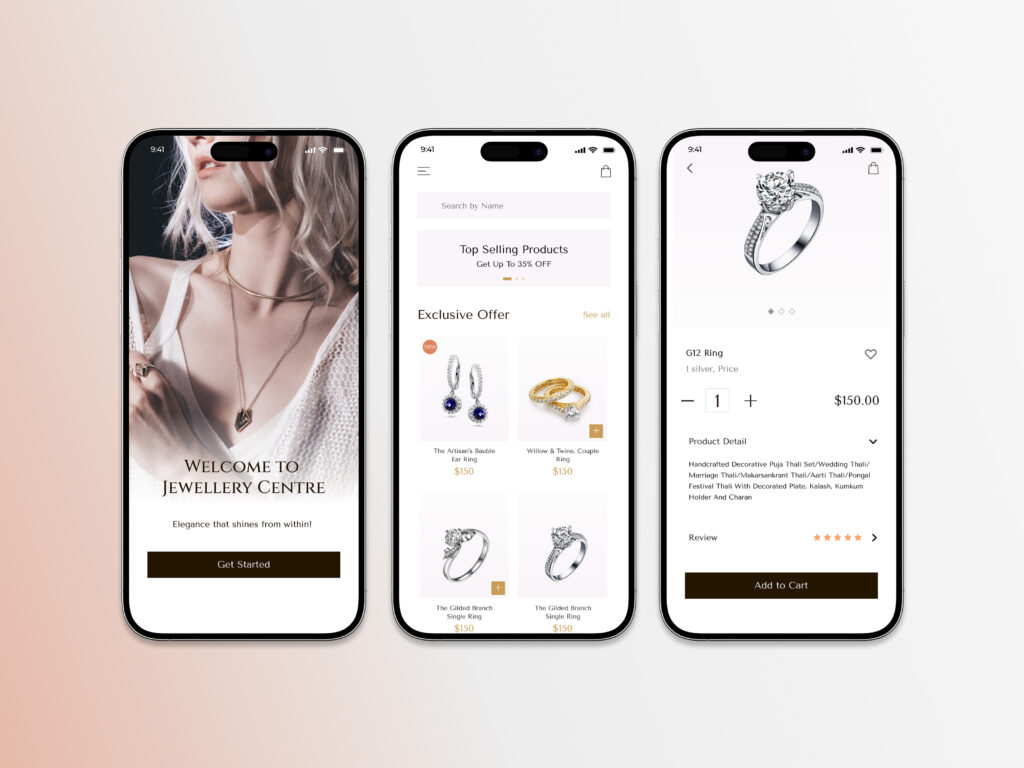
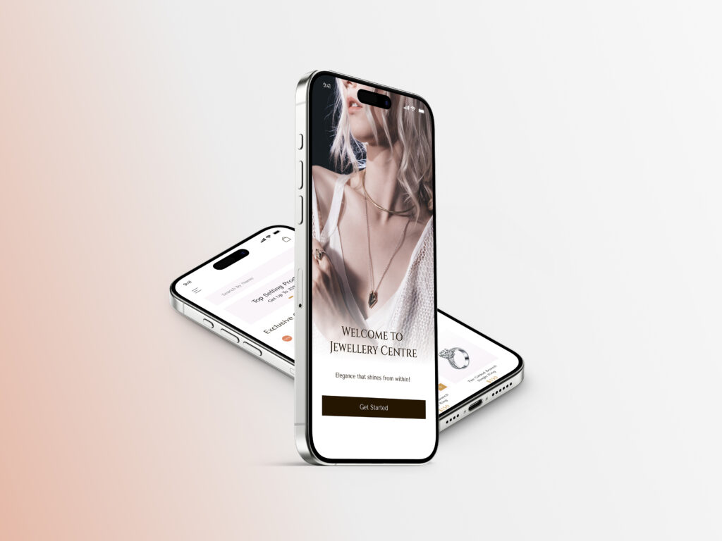
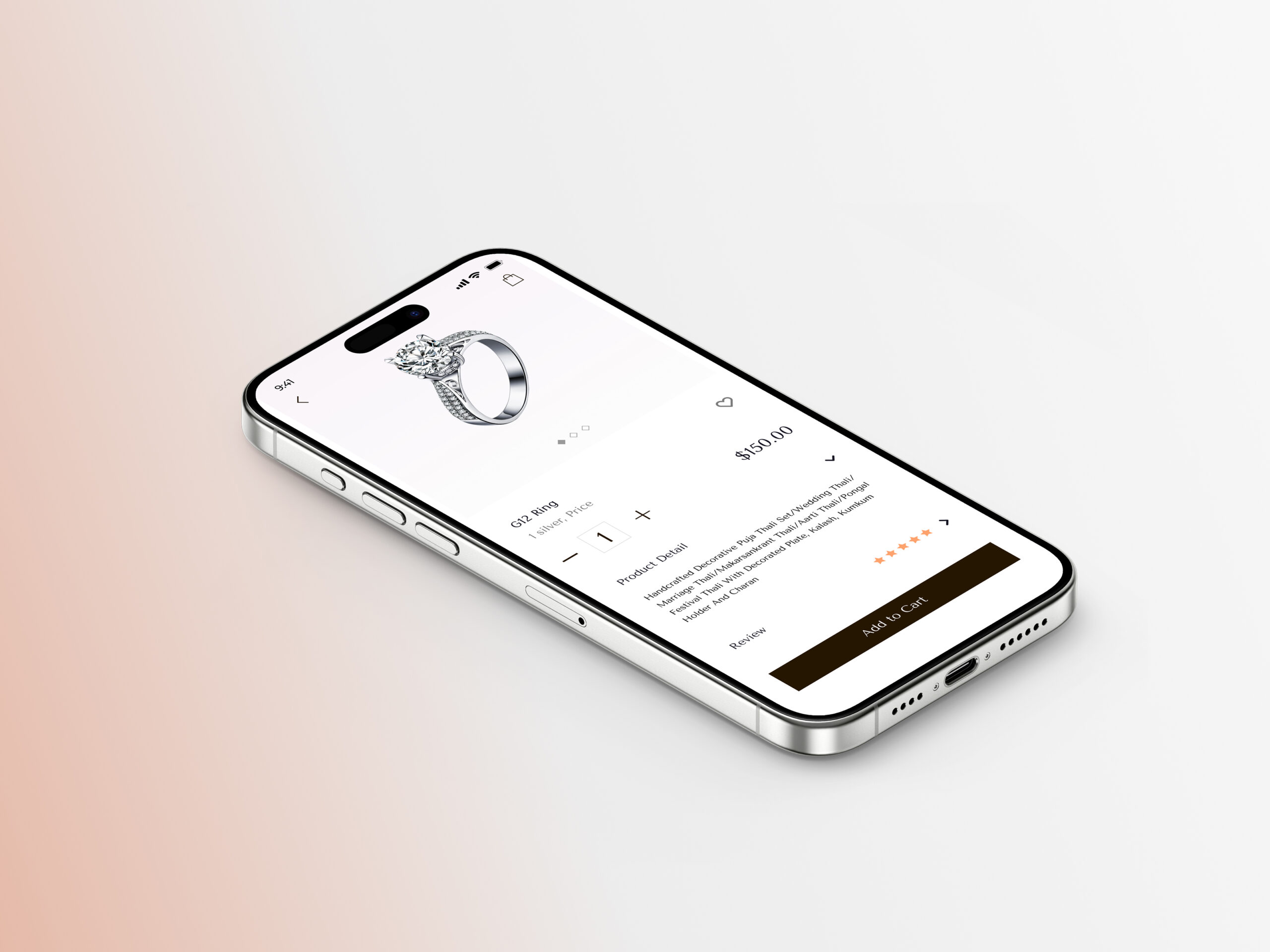
Lumina is a mobile app designed to provide users with a seamless and engaging jewelry shopping experience. The app offers a curated selection of high-quality pieces, combining elegant design with user-friendly functionality.
Here are 3 strategy points for the Lumina app, along with a one-paragraph description
Focus on a curated selection of high-quality jewelry
Prioritize a seamless and engaging user experience
Combine elegant design with user-friendly functionality
Design
My design process for Lumina
User Research
Design Solutions
Visual Language
Implementation and Evaluation
Client
Kristin Watson
The Lumina app is strategically positioned to capture the market segment that values both high-quality jewelry and a sophisticated shopping experience. By offering a curated selection of pieces and emphasizing a seamless, engaging user journey, Lumina aims to foster customer loyalty and stand out from competitors. The app’s design philosophy centers on the fusion of elegant aesthetics and user-friendly functionality, ensuring that customers can effortlessly find and purchase the perfect piece of jewelry.
My design process for Lumina is as follows:
I collaborated with developers to ensure that the design was implemented accurately and effectively. I also conducted user testing and gathered feedback to evaluate the design’s effectiveness and identify areas for improvement. This iterative process of design, implementation, and evaluation ensures that the final product meets both user needs and business goals.
I translated research findings into tangible design solutions. This included creating user flows, wireframes, and prototypes to visualize the user journey and interaction patterns. I paid close attention to information architecture, ensuring that content is organized in a clear and intuitive manner.
I began by deeply understanding the target audience and project goals. This involved conducting user research, analyzing market trends, and gathering insights to inform design decisions.
I developed the visual language of the product, including color palettes, typography, and imagery. I strove to create a cohesive and modern aesthetic that aligns with the brand and enhances the user experience. I adhered to accessibility guidelines (such as WCAG) and platform-specific design principles (such as iOS guidelines) to ensure that the final product is usable by everyone.
All screens
Coming soon: A complete look at the screen designs and all design stage elements.


