Class app design
The Class app is a comprehensive tool for students, enabling them to view schedules, assignments, and results, and to connect with teachers and university officials.
Strategy
Create a user-friendly app that simplifies administrative tasks for teachers, promotes student engagement, and facilitates seamless communication with parents.
- The Design Approach
- Project Challenge
- The Solution
Design
As a UX/UI designer, my process is centered around creating user-friendly and visually appealing digital experiences.
- Research
- Design
- Implement
- Evaluate
Client
For Research
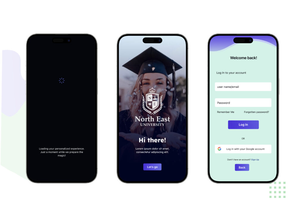
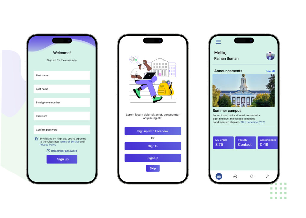
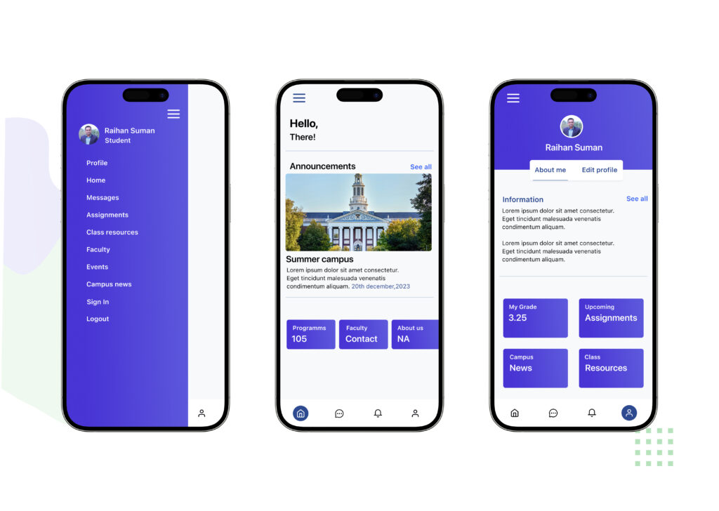
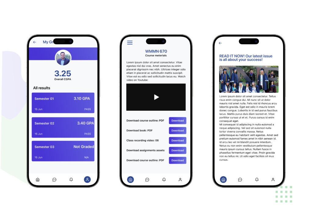
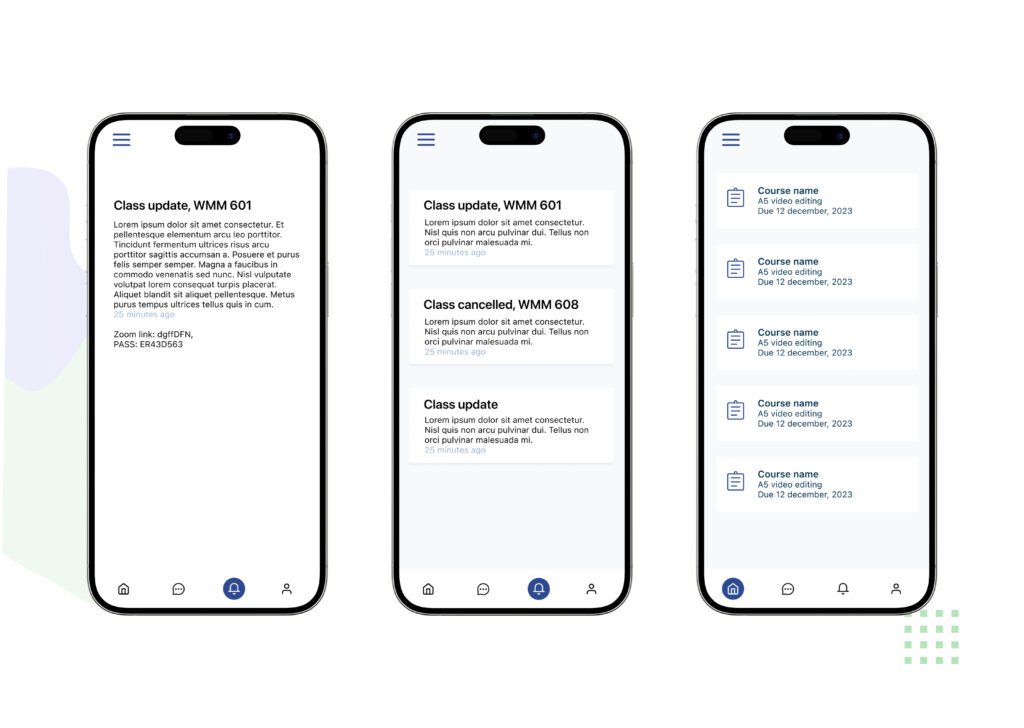
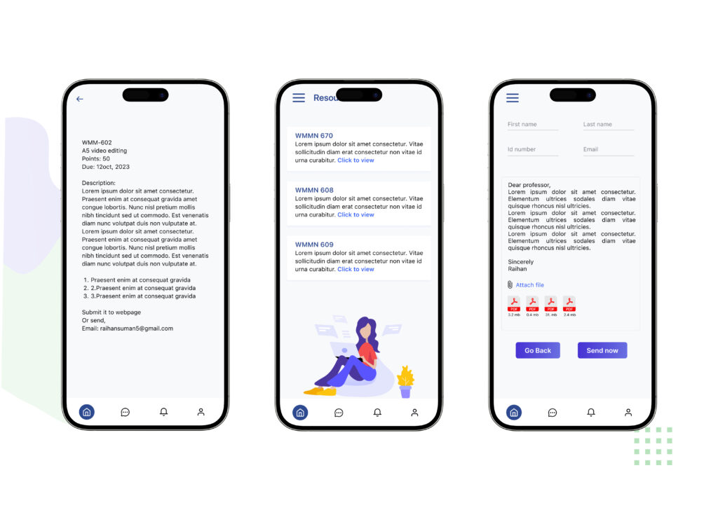
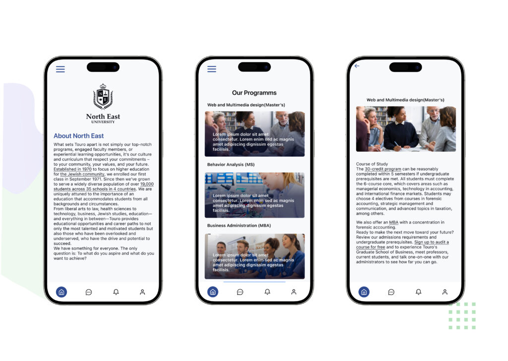
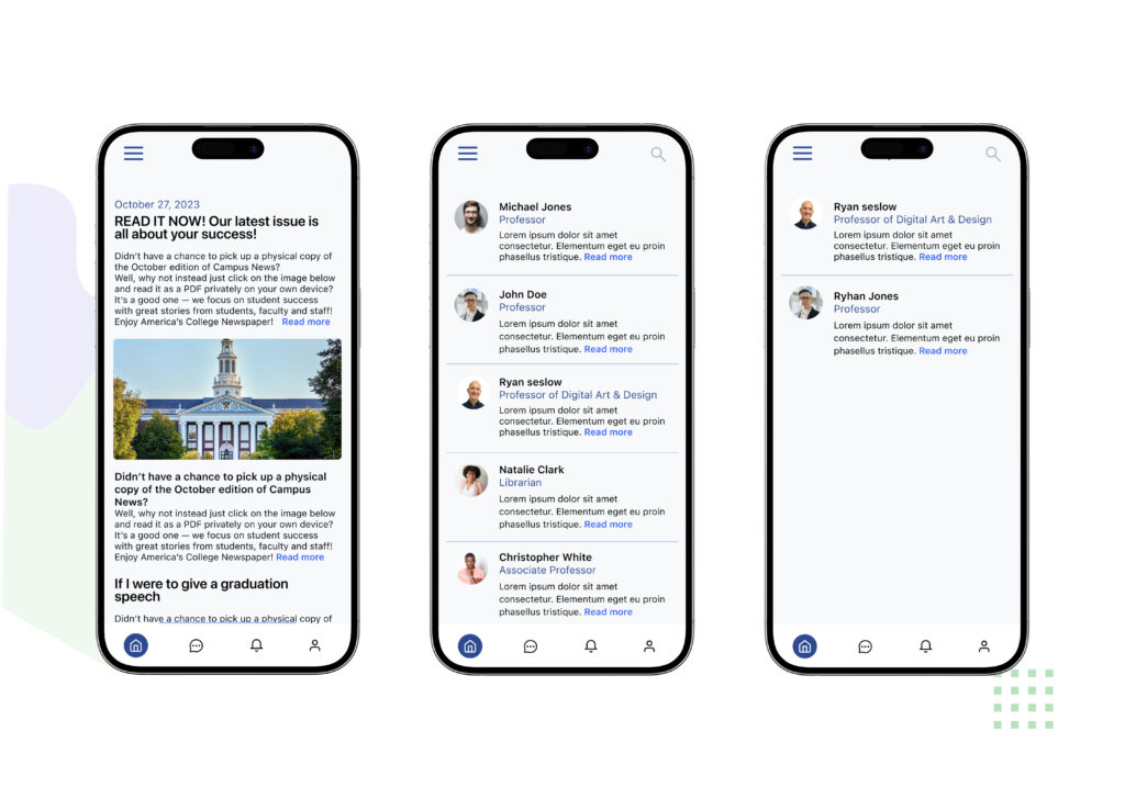
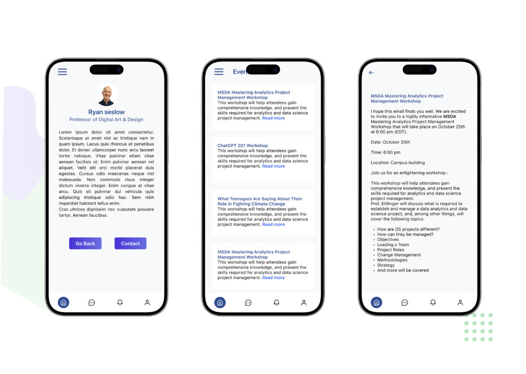
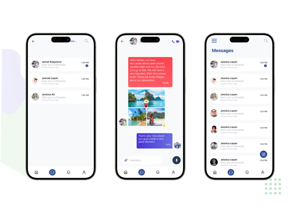
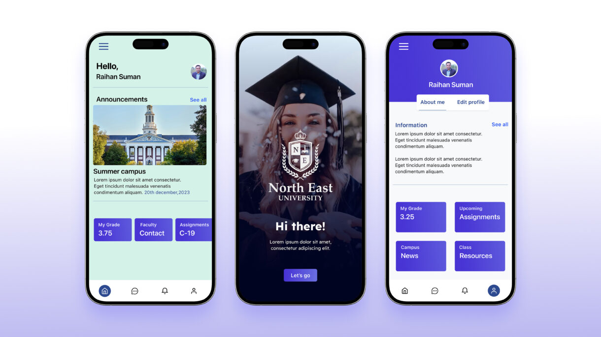
The Class app is designed to streamline and enrich the academic journey of students by offering a centralized platform where they can effortlessly manage their class schedules, track assignments, and view academic results. In addition to organizing essential academic information, the app fosters smooth and effective communication between students, teachers, and university officials, ensuring everyone stays connected and informed throughout the academic year.
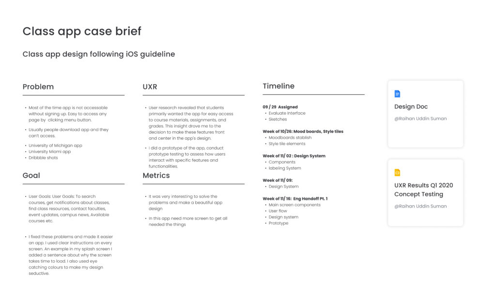
Class app case brief
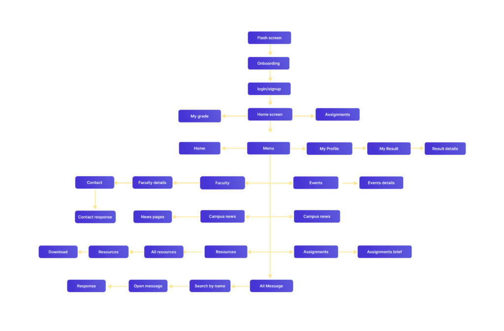
User flow
The user flow for the Class app is a key element in its design, ensuring an intuitive and efficient experience for students. The app is designed to allow students to easily navigate to their class schedules, view assignment details, check their results, and use the communication tools to connect with teachers and university officials. This intuitive flow is established from the mid-fidelity wireframes, which prioritize a clear visual hierarchy to help students quickly find the information they need and complete their tasks.
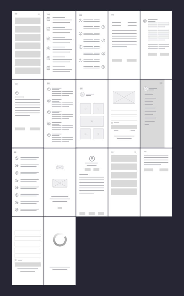
Lofidelity wireframes
These low-fidelity wireframes provide a foundational outline of the Class app’s user interface and navigation. They illustrate the basic structure and layout of key screens, showing how students will access essential features such as class schedules, assignments, results, and communication tools for connecting with teachers and university officials. The wireframes focus on presenting the core functionality and information hierarchy, emphasizing a user-centered approach to ensure a clear and intuitive experience.
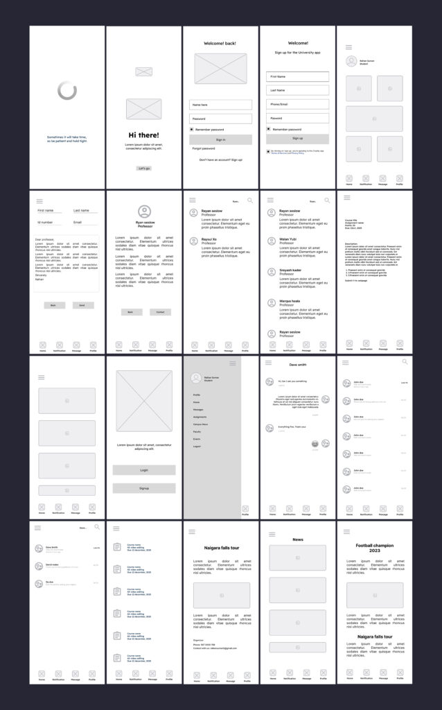
Mid-fidelity wireframes
These mid-fidelity wireframes offer a more refined representation of the Class app’s user interface than low-fidelity wireframes. While still focusing on structure and layout, they incorporate more specific details, such as basic typography and UI elements. They provide a clearer sense of how students will interact with the app’s features, including class schedules, assignments, results, and communication tools, and establish a visual hierarchy for the interface.
Layout grid style
The layout follows a structured grid system to maintain consistency and balance across screens. This ensures clear alignment, organized spacing, and a seamless flow that enhances readability and user navigation.
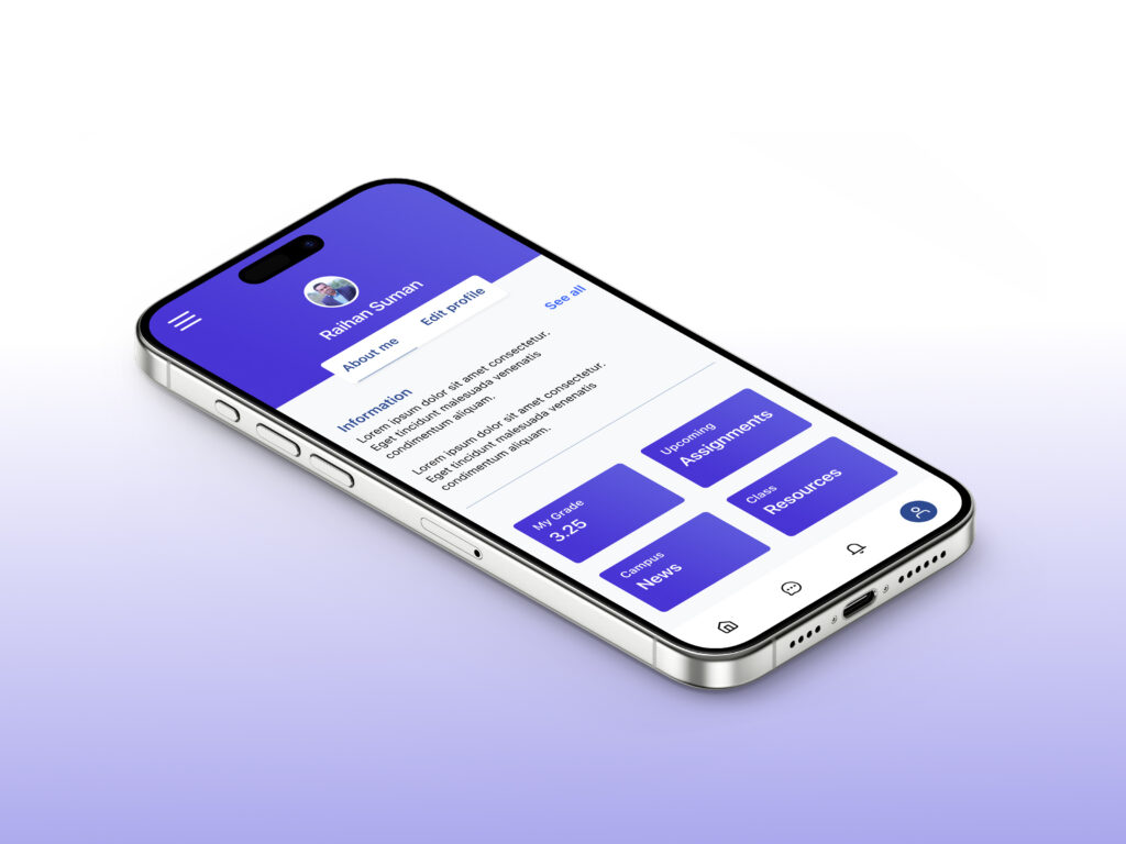
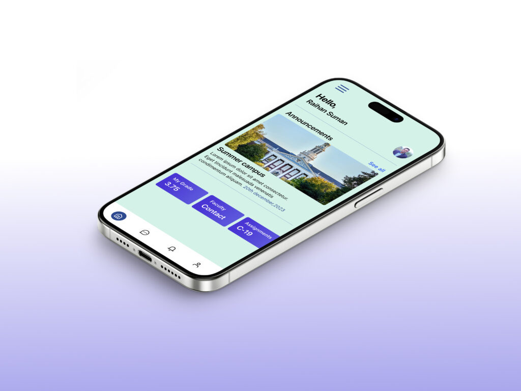
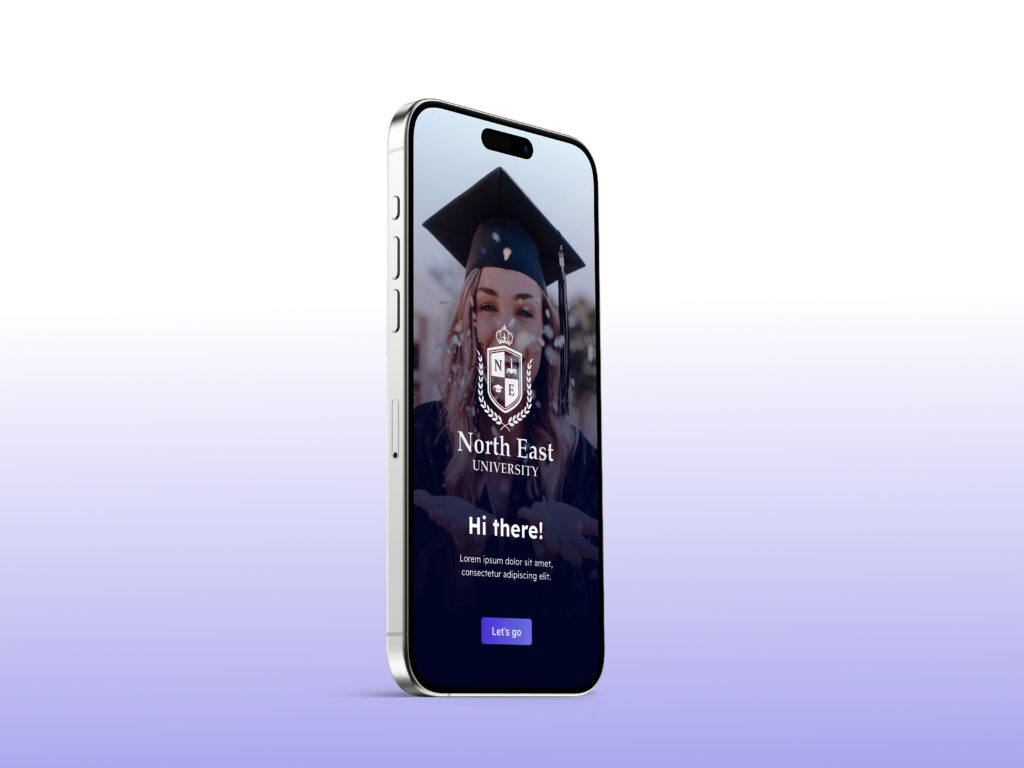
Visual design
The visual design of the Class App is crafted to be clean, modern, and student-friendly, ensuring clarity and ease of use. I applied a minimal yet engaging color palette that balances professionalism with approachability, making the interface feel both academic and inviting. Typography choices emphasize readability across devices, while consistent iconography and spacing create a cohesive experience.
By focusing on hierarchy and contrast, I ensured that key elements like schedules, assignments, and results stand out, helping students quickly access the information they need. Subtle visual cues and intuitive layouts guide users naturally through the app, supporting both functionality and aesthetics.
The overall design combines simplicity and usability, resulting in an interface that is visually appealing, easy to navigate, and aligned with the needs of students and university communities.