
Remindly app full case study
Remindly is now an exceptional app. Its personalized reminders, seamless integration, and user-friendly interface make it a powerful tool for managing tasks and events.
Strategy
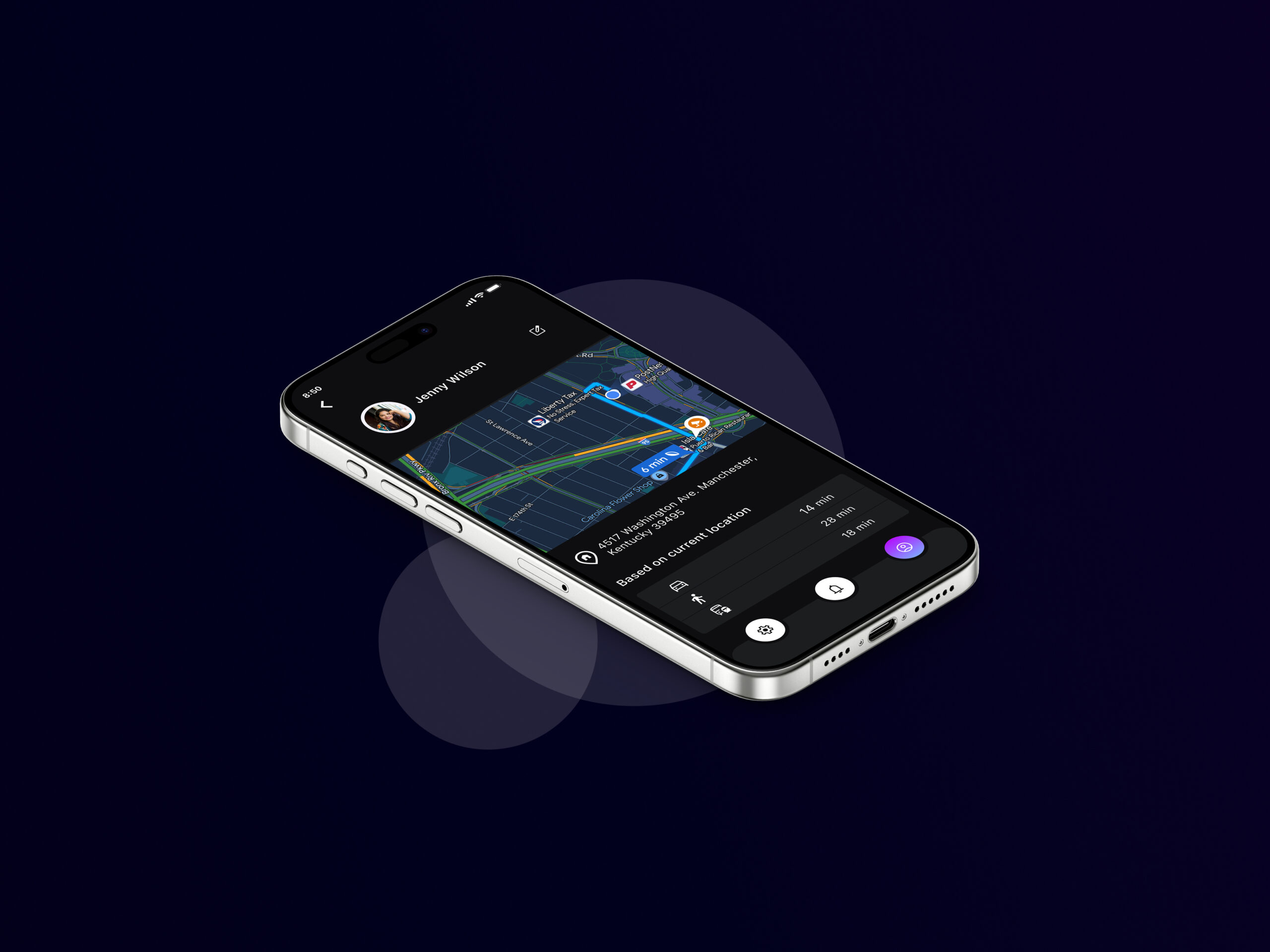
Remindly’s strategy is to provide timely, personalized reminders and integrated support, including gift suggestions, shopping locations, and event directions, to help users act on their commitments and enhance their relationships
- Personalized Reminders:
- Seamless Integration
- User-Friendly Interface
Design
Here are the general design process
- Research: Understand user needs
- Design: Create solutions and prototypes.
- Implement: Build and launch the designed solution.
- Evaluate: Assess the solution’s effectiveness and impact.
Client
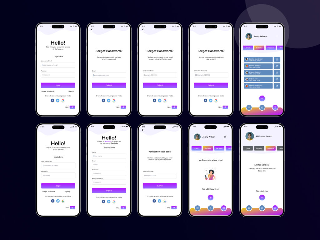
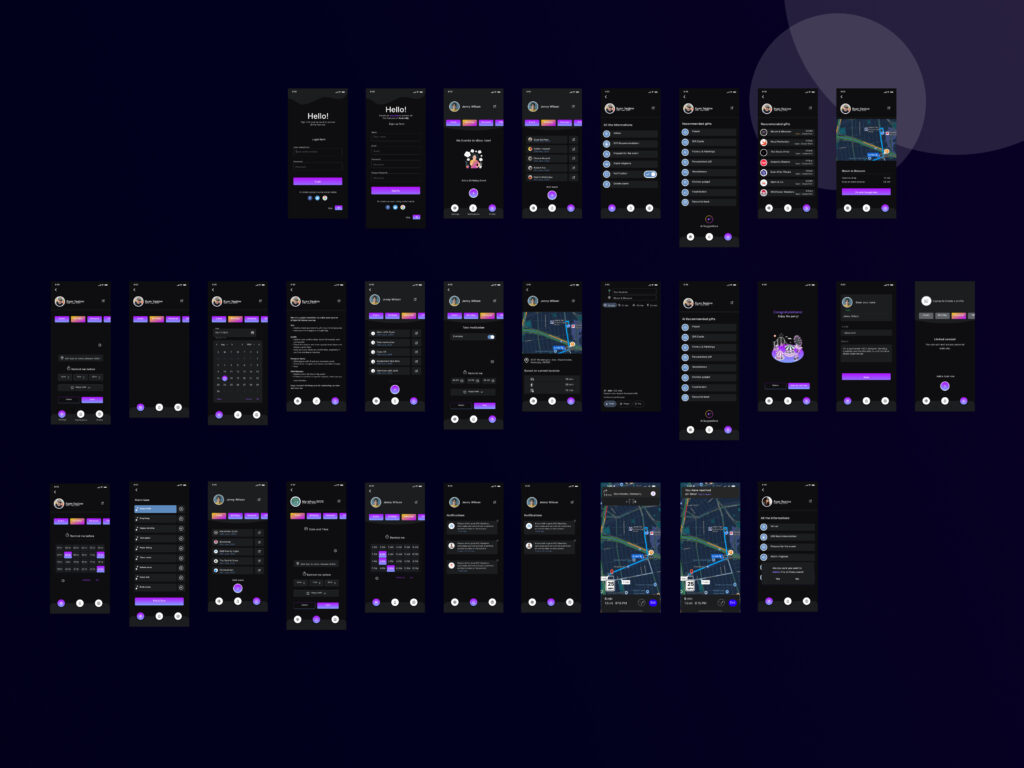
To cater to diverse user preferences and usage scenarios, I designed both light and dark versions of the Remindly app. The light version offers a bright and airy interface, suitable for daytime use, while the dark version provides a comfortable viewing experience in low-light conditions, reducing eye strain and improving battery life. Both versions maintain the app’s core user-friendly design and functionality, ensuring a consistent and enjoyable experience across different environments.

Heuristic Valuation
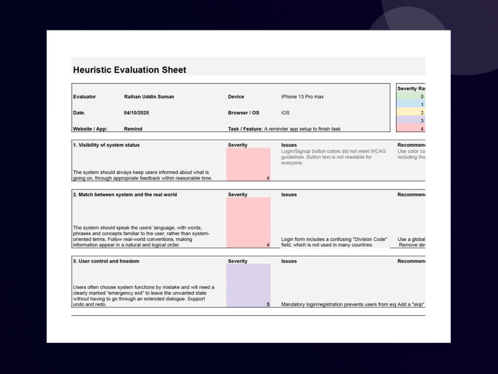
This document presents a heuristic evaluation of the Remindly app, a reminder application. The evaluation was conducted on April 10, 2025, using an iPhone 13 Pro Max. The evaluation focused on the task of setting up a reminder within the app.
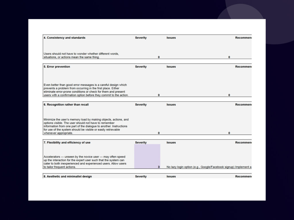
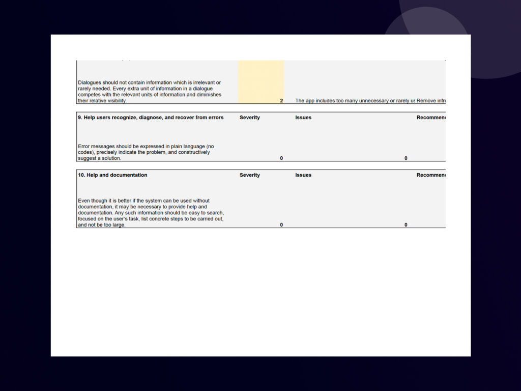
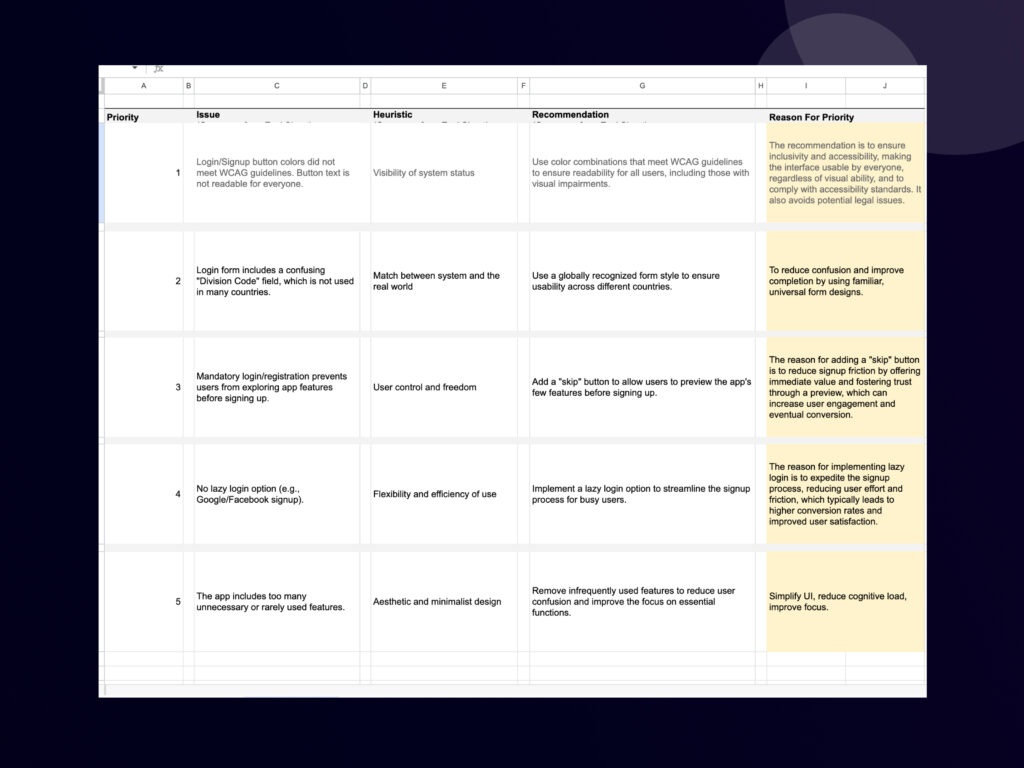
The evaluation identifies several usability issues, including:
Login/Signup button colors not meeting WCAG guidelines, making them potentially unreadable for some users.
The login form including a “Division Code” field, which is not used in many countries.
Mandatory login/registration preventing users from previewing the app’s features.
The evaluation was based on Nielsen’s 10 Usability Heuristics, and the document details the following:
Evaluator: You, Raihan Uddin Suman
Device and OS: iPhone 13 Pro Max, iOS
Website/App: Remind
Task/Feature: A reminder app setup to finish the task
For each identified issue, the evaluation provides a severity rating (ranging from 0 to 4) and a recommendation for improvement. For example, the recommendation for the login/signup button issue is to “Use color combinations that meet WCAG guidelines to ensure readability for all users, including those with visual impairments
The evaluation demonstrates a systematic approach to identifying and prioritizing usability issues within the Remindly app. The findings and recommendations can be used to inform design improvements and enhance the overall user experience.
This heuristic evaluation showcases:
Login/Signup button colors did not meet WCAG guidelines. Button text is not readable for everyone.
Login form includes a confusing “Division Code” field, which is not used in many countries.
Mandatory login/registration prevents users from exploring app features before signing up.
The app includes too many unnecessary or rarely used features.
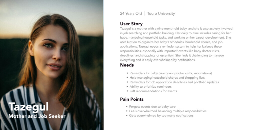
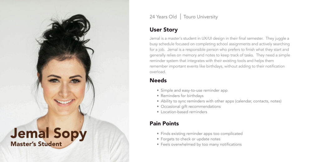
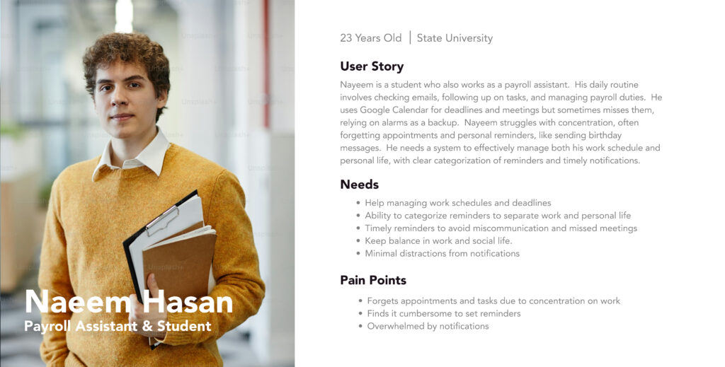
User Personas
User interviews helped me understand busy individuals’ needs for timely reminders, revealing pain points like forgetting important tasks. This led to creating detailed personas that highlighted user motivations and frustrations. By designing for these specific personas, I ensured Remindly’s features directly addressed user needs, making it intuitive and effective.
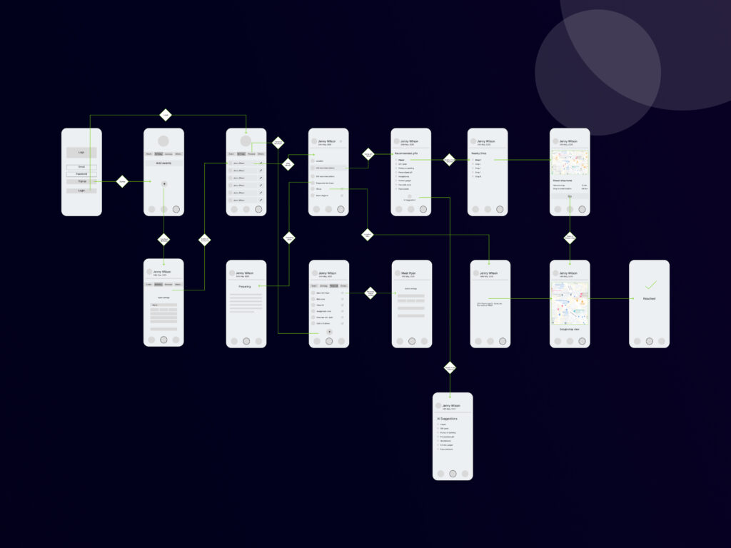
Wireflows
Wireflows were crucial in designing Remindly, acting as a dynamic blueprint. By combining wireframes with user flow diagrams, they allowed me to visualize how users would navigate through the app, screen by screen, and interaction by interaction. This integrated approach helped identify potential dead ends or confusing pathways early on, ensuring a seamless and intuitive user experience for setting, managing, and dismissing reminders.
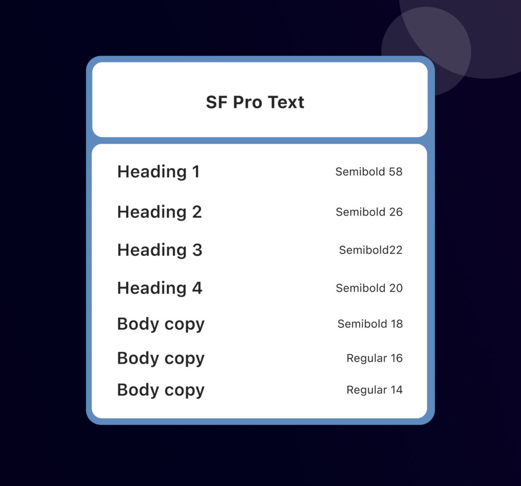
Typography
Choosing SF Pro Text for Remindly provides excellent legibility and a native feel for Apple users. Its systematic weights and sizes create a clear hierarchy, making information easily scannable and the app highly intuitive and readable.
Logo design
This logo for Remindly cleverly combines the initial “R” with a prominent bell icon, instantly communicating the app’s function of reminders and notifications. The clean, solid shapes and harmonious integration within the circular frame create a memorable and effective visual identity. The choice of a soft blue against a dark background suggests reliability and clarity.
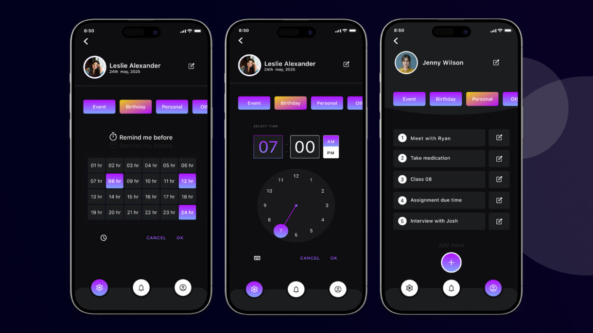
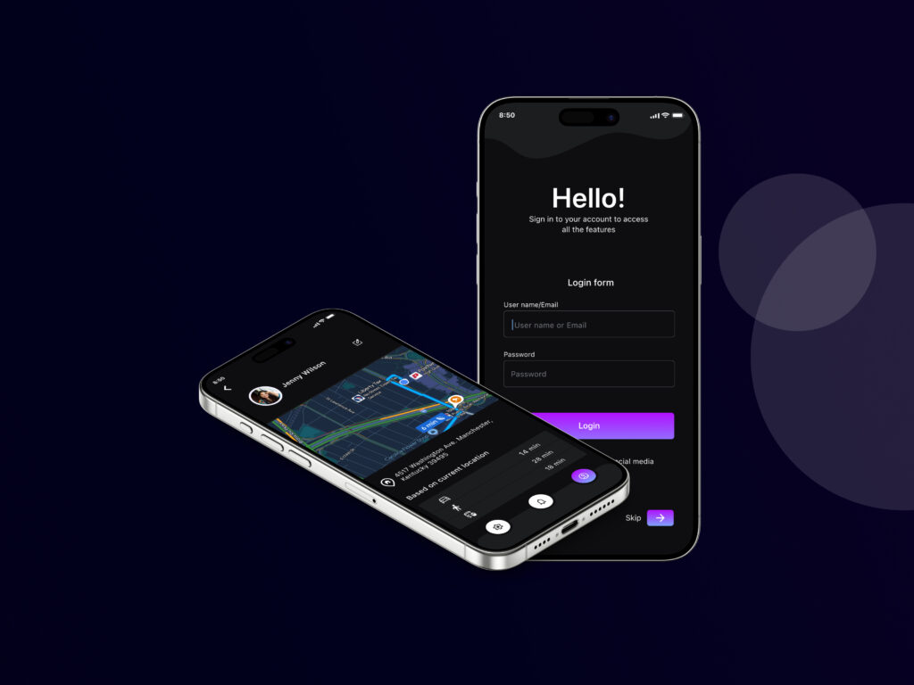
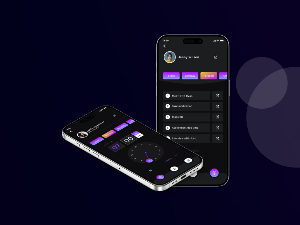
High Fidelity Wireframes
Hi-Fi wireframes for Remindly are detailed blueprints that simulate the final app experience. They incorporate specific typography, color, actual content, and interactive elements, allowing users to “click through” and experience the app flow precisely. This high level of detail is crucial for realistic user testing, clear communication among teams, and refining the visual design before development, ultimately minimizing guesswork and maximizing efficiency.
Designing Remindly with both light and dark mode versions is crucial for several reasons, significantly enhancing user experience and accessibility:
User Preference: Allowing personalization to individual comfort.
Reduced Eye Strain: Optimizing readability in diverse lighting.
Battery Efficiency: Saving power on OLED screens.
Accessibility: Catering to varied visual needs.
Modern Aesthetic: Signifying a contemporary, user-centric design.
Signup process (Light Version)
Signup process (Dark Version)

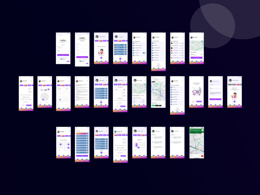
All screens (Light)
All screens (Dark)
Thank you for scrolling..
To see the full project prototype click view project button