
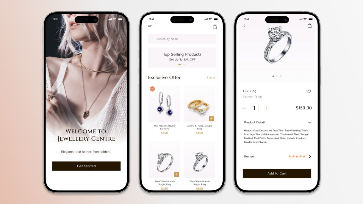
Lumina Jewellery shopping app design
Lumina is a mobile app designed to provide users with a seamless and engaging jewelry shopping experience. The app offers a curated selection of high-quality pieces, combining elegant design with user-friendly functionality.
Strategy
Here are 3 strategy points for the Lumina app, along with a one-paragraph description
- Focus on a curated selection of high-quality jewelry
- Prioritize a seamless and engaging user experience
- Combine elegant design with user-friendly functionality
Design
My design process for Lumina
- User Research
- Design Solutions
- Visual Language
- Implementation and Evaluation
Client
Kristin Watson
The Lumina app is strategically positioned to capture the market segment that values both high-quality jewelry and a sophisticated shopping experience. By offering a curated selection of pieces and emphasizing a seamless, engaging user journey, Lumina aims to foster customer loyalty and stand out from competitors. The app’s design philosophy centers on the fusion of elegant aesthetics and user-friendly functionality, ensuring that customers can effortlessly find and purchase the perfect piece of jewelry.

My design process for Lumina is as follows:
I collaborated with developers to ensure that the design was implemented accurately and effectively. I also conducted user testing and gathered feedback to evaluate the design’s effectiveness and identify areas for improvement. This iterative process of design, implementation, and evaluation ensures that the final product meets both user needs and business goals.
I translated research findings into tangible design solutions. This included creating user flows, wireframes, and prototypes to visualize the user journey and interaction patterns. I paid close attention to information architecture, ensuring that content is organized in a clear and intuitive manner.
I began by deeply understanding the target audience and project goals. This involved conducting user research, analyzing market trends, and gathering insights to inform design decisions.
I developed the visual language of the product, including color palettes, typography, and imagery. I strove to create a cohesive and modern aesthetic that aligns with the brand and enhances the user experience. I adhered to accessibility guidelines (such as WCAG) and platform-specific design principles (such as iOS guidelines) to ensure that the final product is usable by everyone.
All screens

Coming soon: A complete look at the screen designs and all design stage elements.